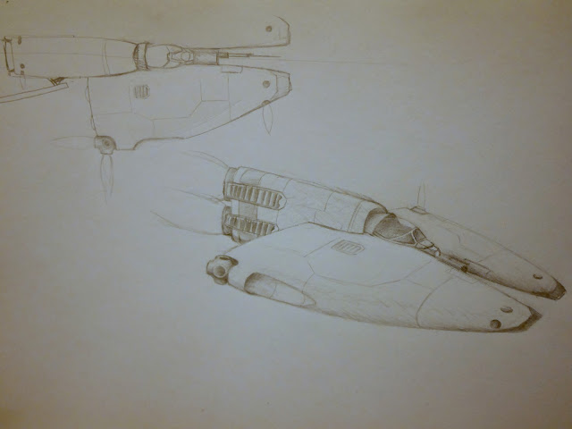
Tiger Barb Concept - Light Fighter

Spacecrafts, buildings and other 3D asset creation
bobtheterrible
Posts: 148
Joined: Sat Jan 24, 2015 8:03 pm

Tiger Barb Concept - Light Fighter

Post by bobtheterrible »

Ok this forum has been far too quiet...

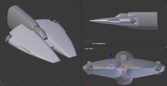
I have had a couple of evenings off and have been relaxing by moving some vertices around. Here is a rough-out of the concept I posted a couple of days ago. I think it looked better in my head but I have started now so I will see where it goes...

Image

.blend
https://drive.google.com/open?id=0B0_sT ... k5NLUVWdnc

Comments and criticisms welcome.
bszlrd
Posts: 1084
Joined: Mon Jul 01, 2013 3:25 pm
Location: Budapest HU

Re: Tiger Barb Concept - Light Fighter

Post by bszlrd »

Hey, it looks nice.
Let's also attach your drawing too, so they're on the same thread. :)
Image

I've checked your file and I think the ship has quite a promise.
I've put on a quick and dirty canopy to check the scale. I think the scale is good. And the cockpit could provide a very nice view when this ship eventually gets it's custom cockpit:
Image

The silhouette can be very odd from some views, especially from the top/bottom it feels like it has a handle or something. Like an ice-cream. Not sure how I'd alleviate that though, but I will roll it in my head.
Image
One solution could be my pet-pewee heat-sink fins on the back the horizontal fuselage, they could break up that emptiness and balance the whole thing a bit. But it's just an idea, I don't want to push it.
Image
Image

On a technical side, I see you bumped into the shortcomings of subsurfaceing an boolean operations with the retro thruster hole. I never use booleans myself, they are too unpredictable. What I'd do here instead is that I'd first finish up the subsurfed geometry of the fuselage, and apply the modifier. After that I'd go to front view, create a separate circle with the needed amounts of vertices.Then select both the circle and the fuselage, enter edit mode for the fuselage and use the knife project tool (Space -> search for "knife", no default hotkey for it for some reason). It will project the circle to the mesh of the fuselage, cutting it up, but not removing anything. Then I do the necessary cleanups, and extrude away.

Also I think it's a bit overwieght regarding tri-count. You don't really need that level of smoothness in the end.

And a question: what does Tiger Barb mean/refer to?
DraQ
Posts: 149
Joined: Sun Mar 23, 2014 10:02 pm

Re: Tiger Barb Concept - Light Fighter

Post by DraQ »

I can't say I like it.
It has this problem you often see in crappy sci-fi ship design where creators take random "cool" shape and roll with it or add random "cool looking" doodads to a ship to make it look "better".
A good design should allow designer to answer about any question about the shape of the ship or any of its components with some engineering consideration.

That said, I really like the RCS thrusters and I think the version with radiator fins looks much better than without.

Other than that, nice concept sketch and we should really make transparent cockpits the norm in Pioneer (as long as we are going with actual windowed cockpits, that is).
FluffyFreak
Posts: 1343
Joined: Tue Jul 02, 2013 1:49 pm
Location: Beeston, Nottinghamshire, GB
Contact:

Re: Tiger Barb Concept - Light Fighter

Post by FluffyFreak »

I do like it.

The version with the radiator fins break up the rear end shape but what causes the "handle" problem at that end is that you've not stuck to the shape from the sketch.

In the sketch the rear is curved to contain the main engines, the nozzles of which protrude from the end of the ship.
This gives it a more shapely outline around that part of the ship.

So perhaps curve the rear section so that it obviously encloses the two long cylinders of the engines (link in linked photo), and then bulge & curve the centre to fatten it out a little bit.

Then the radiators will complement it, or you can even have a couple of radiators coming off the rear engine area itself.

Otherwise I like it overall, it reminds me of classic Wing Commander ships or the A-Wing but still distinctly very Pioneer.

Andy
impaktor
Posts: 1008
Joined: Fri Dec 20, 2013 9:54 am
Location: Tellus
Contact:

Re: Tiger Barb Concept - Light Fighter

Post by impaktor »

Yes, very nice work @bobtheterrible! Keep it up!

The sketch looks amazing, and the blender model looks like a very good start.
So perhaps curve the rear section so that it obviously encloses the two long cylinders of the engines (link in linked photo),
I had the exact same thought, but didn't know how to describe it.
bszlrd
Posts: 1084
Joined: Mon Jul 01, 2013 3:25 pm
Location: Budapest HU

Re: Tiger Barb Concept - Light Fighter

Post by bszlrd »

@Draq: I don't see what you are talking about. This ship is far from random cool shapes bunched together. It clearly has a sense of balance and symmetry, which is achieved by using bold and clean shapes, which gives it a nice clean silhouette. No doodads to give it the cool really.
Also 'we' could do transparent cockpits any time, the only thing we need is a good pilot model (not easy and quick to do it nicely, but you are welcome to work on it if you have modeling experiences) and some good cockpit furnishing to surround the pilot.
Although I was thinking about having semi-transparent cockpits, which would only show a loose silhouette of the pilot and the interiors, akin to the way I made the internal windows of the orbitals. Since you won't really be seeing it much, given the speeds and distances in the game after all.

I like Fluffyfreak's idea for the engine encasing.
DraQ
Posts: 149
Joined: Sun Mar 23, 2014 10:02 pm

Re: Tiger Barb Concept - Light Fighter

Post by DraQ »

nozmajner wrote:@Draq: I don't see what you are talking about. This ship is far from random cool shapes bunched together. It clearly has a sense of balance and symmetry, which is achieved by using bold and clean shapes, which gives it a nice clean silhouette. No doodads to give it the cool really.
No, but it really does have "cool sci-fi fighter" written all over. The shape is whimsical and not exactly functional - for example why two pronged nose? It weakens the construction, limits internal space, adds extra structural mass and makes aerodynamics suffer. It sounds like something that needs a good reason to be there but there is no reason for this construction aspect that would be apparent from the model.

Contrast Homeworld's Kushan interceptors where the reason for dual pronged design is "weapon bay housing two massive rotary railguns".

Also contrast pretty much all the other Pioneer ships which are either more or less realistic looking sleek aerodynamic shapes (Wave, Venture Star, Deneb) you could easily imagine coming from serious aerospace concepts, angular boxes clearly designed first and foremost for vacuum of space, with wedge-shaped front as the only concession to aerodynamics (all OPLI ships), streamlined blobs that could be this way due to aerodynamics as much as due to space efficiency or structural concerns, with little care for aerodynamic lift or other finer aspects of atmospheric flight (Kaluri), or rounded boxes with vaguely naval looking vertical configuration - ok, an idiosyncrasy, but not inherently more puzzling than pretty much any other configuration possible - (Mandarava-Csepel).

Put something in between prongs that needs this kind of forward looking clearance (or alternatively put two somethings in the prongs themselves to justify them being there and staying separate and the problem is gone.
Sorry, but senseless sci-fi ship design is a bit of my pet peeve (I have a whole lot of those) and I'm somewhat allergic to things that look odd for no reason.
I have always liked my spaceships utilitarian, to the point of being downright ugly if needed.
Also 'we' could do transparent cockpits any time, the only thing we need is a good pilot model (not easy and quick to do it nicely, but you are welcome to work on it if you have modeling experiences) and some good cockpit furnishing to surround the pilot.
Sadly, I suck at modelling but does it need to be that good given how tiny it will be?
also it seems like a do once thing as pilot+seat+furnishings could be reused for pretty much every ship afterwards.

Also, maybe instead of making unique cockpit models we could actually use part of the ship model as it is? The only part of the actual cockpit model that would have to be done individually then, would be instruments (I'd love to see most, if not all ship functions migrated there), but they could be made modular, only changing their arrangement between ships.
bobtheterrible
Posts: 148
Joined: Sat Jan 24, 2015 8:03 pm

Re: Tiger Barb Concept - Light Fighter

Post by bobtheterrible »

Whoaa I feel like I have opened a whole can of worms here :)

First of all I'd like to say a thank you to the complements, suggestions, ideas and criticisms - the response has been more (and better) than I had been expecting and is much appreciated!

Ok lots to respond to in no particular order...

I think concept design for a game such as Pioneer is kinda interesting. I know what DraQ means about ornately faceted spaceships defying sense or reason but scifi, as much as anything, is about exploration of ideas and creativity. Some of the art work I have seen on the web is simply stunning and I really enjoy losing myself daydreaming up all sorts reasons or back stories about why things look the way they do. To me Pioneer sits quite neatly in the middle ground - it is not a hard core space-sim (although it has some very nice physics :) but neither is it Japanese anime (no slight intended, I like Japanese anime!). I like functional and reasoned but I also like the aesthetic - the functional is a little harder - Im a biologist not an engineer - but I know what I like to look at :)

As for this particular design, contrary to what you might think, I did actually sit down and think hard about what I could come up with that I both liked the look of yet still had some footing in reality as we can envision it. I will attempt to defend my thesis!

If I pushed hard for the functional, virtually everything I came up with looked like a Star Fury - there is a reason NASA asked for permission to use that design. But Star Furies are non-atmo - something I fell foul of with the Bluenose. So, I wanted something multi role. This design was meant as a fast atmospheric ascent-decent fighter/interceptor primarily used in back water systems that don't have orbital stations. Streamlined would help with this. The streamlined shape would also have the additional advantage of spreading the effect of energy weapons over a larger surface area - although Im not actually sure if this would make that much difference in reality!!

The oversized RCS thrusters were placed roughly inline with the apparent centre of mass and large enough to throw the ship around in dogfights, off-primary engines, while keeping the nose and guns on target. The over-under engines are not too outlandish and are a nod towards contemporary aircraft such as the English Electric Lightning etc... (HA! just clicked on Fluffy's link!!) The "wings" are fat enough to house fuel tanks - hinted to by the protrusions at the rear (oxidiser on one side hydrogen on the other) with limited space for avionics toward the front. The air intake behind the cockpit is exactly that and has precedent in both Pioneer (the lovely work done by noz al la Mandarava-Csepel) and the real world (Skylon). Other than that there is not really much else going on :)

For the implementation comments - yes, too many tris, I know its pretty to look at with gazilions of tris ;)
I am coming round to the idea of of trailing heat sinks and will have a play with some ideas in coming posts.
I like the idea of pinching the fuselage around the engines (just looked at that link, see above) although I have a few considerations to think of. My limited knowledge of rocket engines is that actually they are pretty short and would not be as long as those Avon engines. The rest of the forward space would be occupied by landing gear, the hyperdrive and the air cooler/condenser needed for atmo flight (see, I did think about this stuff!). Aesthetically, pinching might look nice so I will give it ago :) I will also have a look at making the rear a little more interesting.

One thing that is bugging me is that I am running out of space to put things like weapons and missiles without opening up holes in the fuselage (quiet DraQ! ;) this is something that needs some thought...

Thanks again for all the input, when time permits I will post some more.

Cheers
Bob :)
FluffyFreak
Posts: 1343
Joined: Tue Jul 02, 2013 1:49 pm
Location: Beeston, Nottinghamshire, GB
Contact:

Re: Tiger Barb Concept - Light Fighter

Post by FluffyFreak »

Getting a playable version of this would be good, with a cockpit model extracted from the ship mesh itself would be nice so we can get a feel for it ingame.

Andy
bobtheterrible
Posts: 148
Joined: Sat Jan 24, 2015 8:03 pm

Re: Tiger Barb Concept - Light Fighter

Post by bobtheterrible »

Ok Im bringing this thread back up as I have it a wall both with this model and other projects Im using to keep myself sane. This is going to seem utterly lame but but I have been trying for some time and I cannot figure out -how- noz made that canopy. Everything I try ends up looking like a lumpy, uneven mess. It feels like there should be an easier way but I just cant find an example. Im not expecting this to be done for me but any pointers would be hugely appreciated /:-)
Post Reply