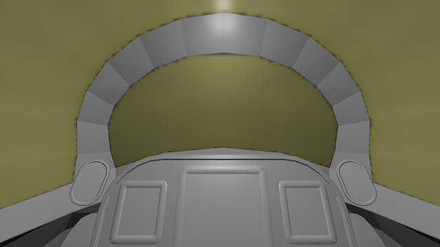
3D Cockpits

Spacecrafts, buildings and other 3D asset creation
bszlrd
Posts: 1084
Joined: Mon Jul 01, 2013 3:25 pm
Location: Budapest HU

Re: 3D Cockpits

Post by bszlrd »

Those texts are intentionally small on that cockpit, so the player isn't drawn in hunting for data and stuff. Most of them are gibberish or poems anyway, just to set the mood.
Zooming ability might be more organic and less distracting then a po-pup with the data in my opinion. Or a double click on the screen centers it and adjusts the zoom to get a good view. Crucial flight data should be large enough to be readable in any situation, but some things could be smaller. This is a long way to go anyway, so we have plenty of time to experiment. :)
We sure need to play around with their size to see what works good. The previous textures were a bit more readable, but still not perfect, at least on 1920* (see it in full size):
Image
Right now I'm working on the cockpit of that new ship I started, so I can build screens and other furnishing in context. I sure want to play with text sizes there to see what's readable and what's not.
Nyankosensei
Posts: 235
Joined: Wed Sep 11, 2013 8:03 pm

Re: 3D Cockpits

Post by Nyankosensei »

My 2 cents, is better have a nice and readable HUD than many instruments in cockpit, otherwise you can put some backup instruments in case of HUD failure like reals planes.
Alyas
Posts: 4
Joined: Wed Feb 12, 2014 1:21 pm

Re: 3D Cockpits

Post by Alyas »

Zordey wrote:I am not a huge fan of full cockpits (in any game really) but I do like the look of the first 2 shots there. Unfortunately I think most ships cockpits will be rather more like the bottom screenshot which is totally useless for flying (and therefor wont be used beyond initial amusement)

But I suppose it is all about giving choice, and once you are in space, there isnt much to see anyway...

Nozmajner, where can I grab a copy of your cockpits to have a look how they are put together?
Realistically there is no way in heck that anyone would pilot a ship using a cockpit consisting of just some tiny windows. More likely than not you'll end up with some sort of three dimensional first-person display(full-color holographic?) with proper overlays rather than mechanical dials. Perhaps even have options to display things like warp-trails and shielding with the sensors and display. And a navball style radar.
bszlrd
Posts: 1084
Joined: Mon Jul 01, 2013 3:25 pm
Location: Budapest HU

Re: 3D Cockpits

Post by bszlrd »

Realistically even the tiniest ship in the game is a weapon of mass destruction with these powerful, high delta-v engines. Imagine hitting Earth with a 9t Xylophis at top speed (~7000km/s) It's on par with a larger nuclear bomb. Quite a bullet.
Realistically these ships would melt themselves in seconds without huge heat radiators if we would check the waste heat production of these engines.
Realistically everybody on these ships would be meat paste on some of the ships which have 10G+ accelerations. I could go on for a while with this, but you get the point. :)

Pioneer is a game, not a simulator. We can take artistic licenses or game-play choices if it enhances the user experience. We want to make an enjoyable and immersive game. And cockpits could provide some immersion, especially when Oculus Rift and such hits the market for good. Cockpits could also add a sense of scale if done right. And a good sense of scale is a thing a lot of space games lack.
We don't want to accurately predict the future either. Most sci-fi which tries hard to predict specifics don't age well anyway. Sci-fi talks to the present, not to the future.

And the whole thing will be optional anyway.
Alyas wrote: More likely than not you'll end up with some sort of three dimensional first-person display(full-color holographic?) with proper overlays rather than mechanical dials.
You still need to control the ship and the display itself. Even if it's some kind of mind linkup, which would warrant the lack of buttons and switches. But even then I would want some kind of fall-back if mind linkup fails for some reason.
FluffyFreak
Posts: 1343
Joined: Tue Jul 02, 2013 1:49 pm
Location: Beeston, Nottinghamshire, GB
Contact:

Re: 3D Cockpits

Post by FluffyFreak »

These are all going to be links to traditional fighter-cockpit designs, however the takeaway from them is not the carcass or layout of the cockpit but the instruments.
In all of the ones that I really like there is a single main cluster of instruments directly in front of the player but slightly below their line-of-sight

Like these from "Wings of St Nazaire"
Image
Image
or from Tie Fighter;
Image
Which has a cluster of extra info around the outside but the main info is dead centre.

What I think they all have is combat info - which initially detracts form them as examples.
Now Pioneer needs more than combat information but this layout is still preferable to having many screens spread around with pieces of information on each.

If you think about it you don't need navigation information during a firefight, and you don't need combat and targetting information during basic navigation.
You'd want to switch from one to the other so you have the relevant data to hand in the situation you found yourself in.
Likewise you don't do much navigation sat in the pilots seat, it's done beforehand, or when sailing you do it away at a chart table (fancy name for a large enough flat surface that isn't currently being used to prepare food!) and then you return and applying what you've plotted for the next few hours/days.
You only really want to have the minimum information for each situation so that you're not being distracted or confused by worthless information about the other situation that you're not actually dealing with at the time.

So:
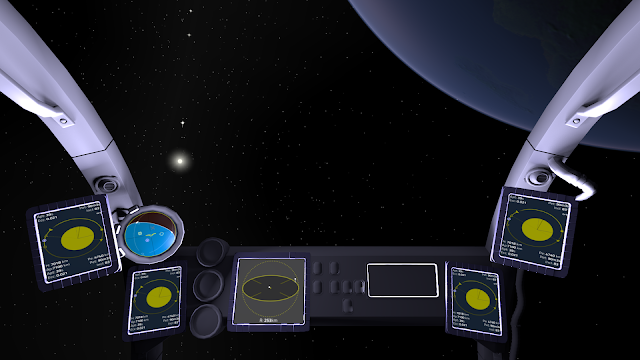
[*] I quite like the current cockpit-ball-thing we have (I think it needs a proper name!) because it's logical in that it's a VR/AR sphere located somewhere inside the ship and it's both very different AND going to work brilliantly with the Oculus Rift (it already does in fact if you've seen my video).
[*] I'm not keen on the spread out nature of the instrument windows currently and think there should be less screens that are more clustered and that they will be multi-functional eventually - I am aware that I'm supposed to eventually write some of that render-to-screen code too, I haven't forgotten ;)
[*] I would like to see some traditional _looking_ cockpits like those linked too in the images even if they are still AR/VR in nature as they just satisfy part of my brain that really enjoys seeing them - it's like remembering when I got to sit in the cockpit of an RAF Tornado when I was a kid after waiting for the huge queue to finally go away at the end of the day and not even being able to see out without kneeling and peering over the sides, y'know? Not right, not necessary, but really just gets me in the correct part of my brain/heart.

Whether or not we'd actually just have it all projected into our brains is kind of irrelevant because in reality the computer would be doing all of the flying whilst being tended to by it's meat-slaves ;) so this is more about what looks, feels and plays right for *us* now.

Andy
FluffyFreak
Posts: 1343
Joined: Tue Jul 02, 2013 1:49 pm
Location: Beeston, Nottinghamshire, GB
Contact:

Re: 3D Cockpits

Post by FluffyFreak »

Also since I think it's awesome here's the Oculus Rift video I did when the cockpit first went in: https://www.youtube.com/watch?v=ONt8aDLE0lI
bszlrd
Posts: 1084
Joined: Mon Jul 01, 2013 3:25 pm
Location: Budapest HU

Re: 3D Cockpits

Post by bszlrd »

FluffyFreak wrote: I would like to see some traditional _looking_ cockpits like those linked too in the images
Something like this? :)
Image
This is the quite small WIP cockpit of the Varada I'm using as a base for developing Mandarava-Csepel prefabs.
FluffyFreak
Posts: 1343
Joined: Tue Jul 02, 2013 1:49 pm
Location: Beeston, Nottinghamshire, GB
Contact:

Re: 3D Cockpits

Post by FluffyFreak »

Yep, kind like that Noz you mind reader :D
baobobafet
Posts: 155
Joined: Thu Jul 04, 2013 10:01 pm

Re: 3D Cockpits

Post by baobobafet »

I must say, I haven't gotten into all the nuts and bolts of this topic as much as I would like to as of late, but I'm certain I speak for many in appreciating all the efforts being made here, looking awesome, guys. (cred where cred is due)

On flight info display, I had this image from the Curiousity rover I thought to share. Not suggesting it needs that level of complexity - but something like a HUD 'see thru' layout might work with or without cockpit views.

Another thought,
If it was possible to have the cockpit slide towards the viewer and disappear entirely on each side of the view when the + zoom key is hit (and - key to enable cockpit to snap back) might be nice. Instead of all the having to go to options menu to turn it on/off to enable a less obstructive view - whenever needs arise.
No idea of the implementation hurdles of doing such a thing, but it might prove more immersive for players.

Anyways,
Here's a low res screenshot with a hires version available below (just for inspiration) -& just cuz it's cool :)
Image
http://s20.postimg.org/wic5qvhgd/Curiou ... ng_HUD.png
Chalito
Posts: 3
Joined: Mon Mar 16, 2015 4:04 pm

Re: 3D Cockpits

Post by Chalito »

Hi!

I just registered to comment on this. I just downloaded the game (have played FFE before, a long long time ago), so please take this as a humble comment and/or disregard it as you will, knowing it's made in good faith.
I was thinking on the subject of HUD consistency.. maybe you can leave the default GUI the game has right now as the official one, so that all documentation/tutorials, etc refer to this, making it trivial to locate instruments and buttons, then leave the 3d cockpits as an optional (as it is now), which you use "at your own risk", and be just like when you buy a new car, that you have to take a moment to check where the displays are, where the different buttons are, etc. This would leave designers the freedom to make a different cockpit for each ship if they so wish (I would love that!), with certain similarities or standards on ships from the same manufacturer, and some others being the same over different brands, having been made into industry standards.

Another example of how the cockpit could work (some have posted images from other games as examples), might be what they did on Elite:Dangerous (I dunno how people in this community feel about that game so I hope I'm not getting into trouble by mentioning this.. I noticed nobody said it though it strikes me as an obvious example so I wonder if there's a particular reason :))

I don't have too much spare time but aside from playing I hope I'll be able to give a hand on the project in any way I can in the future, as I get more familiar with all this.

Thanks a lot for the great game and incredible work !
Post Reply