MRO ship for Haber Corporation Idea
Re: MRO ship for Haber Corporation Idea
Now the question is well she fly.
https://imgur.com/a/sAfxE
Lastly, https://imgur.com/a/5S0O5
The Json file and edited is as to the models and texture in the models directory.
https://imgur.com/a/sAfxE
Lastly, https://imgur.com/a/5S0O5
The Json file and edited is as to the models and texture in the models directory.
Code: Select all
   "angular_thrust" : 8600000.0,
   "capacity" : 30,
   "cockpit" : "",
   "down_thrust" : 600000.0,
   "effective_exhaust_velocity" : 8840000.0,
   "forward_thrust" : 2500000.0,
   "fuel_tank_mass" : 25,
   "hull_mass" : 30,
   "hyperdrive_class" : 0,
   "left_thrust" : 600000.0,
   "manufacturer" : "haber",
   "max_crew" : 4,
   "min_crew" : 1,
   "model" : "mro1000",
   "name" : "mro-1000",
   "price" : 101000.0,
   "reverse_thrust" : 1100000.0,
   "right_thrust" : 600000.0,
   "ship_class" : "medium_ranger_explorer",
   "slots" : {
      "cargo" : 30,
      "engine" : 0,
      "laser_front" : 1,
      "missile" : 0,
      "sensor"  : 0
   },
   "roles" : {
      "merchant" : true
   },
   "thruster_fuel_use" : -1.0,
   "up_thrust" : 1100000.0
}Re: MRO ship for Haber Corporation Idea
I finally have a working copy with the help of nozmanjer.
The file https://drive.google.com/open?id=14EBX6 ... 9-5VYa38Ow
There is one more minor thing to add a minor camera changes.
https://sketchfab.com/models/59391b81c3 ... ddacf2c386
The file https://drive.google.com/open?id=14EBX6 ... 9-5VYa38Ow
There is one more minor thing to add a minor camera changes.
https://sketchfab.com/models/59391b81c3 ... ddacf2c386
Re: MRO ship for Haber Corporation Idea
Can people please check this one out/
MRO1000 version 2
https://drive.google.com/open?id=11UbCj ... gi7zpJ26FU
Sketchfab
https://sketchfab.com/models/c3f39b5822 ... b18e9fc93b
Texture (Gimp .xcf)
https://drive.google.com/open?id=1NVnct ... BEIhenCaV4
MRO1000 version 2
https://drive.google.com/open?id=11UbCj ... gi7zpJ26FU
Sketchfab
https://sketchfab.com/models/c3f39b5822 ... b18e9fc93b
Texture (Gimp .xcf)
https://drive.google.com/open?id=1NVnct ... BEIhenCaV4
Re: MRO ship for Haber Corporation Idea
Looks good to me, but I'm no expert. It's probably too late now, but if I'm to "complain" on anything then maybe the four rectangular boxes for engines looks a bit too simple in my eyes, but then that's the philosophy of Haber.
Re: MRO ship for Haber Corporation Idea
Yea. I took the approach of a over sized pickup truck, cramped, and annoyed. The Haber way isn't explorers so. I think the first attempt at a medium range explorer would be lacking. For example, lots of engines but too small, little to no living space or long distance travel, bare minimum scanning machinery, room for a small vehicle but a little to small for extended outings. Plus give everything some generic model name like it rolled out some industrial factory.
The Haber way.
Re: MRO ship for Haber Corporation Idea
I like that you can see it's a Haber ship, but still quite different from just a bigger Lunar Shuttle. Haber needs more ships anyways. I think it's a great addition to the game!
Re: MRO ship for Haber Corporation Idea
Great looking ship.
Nitpicks: The flaps that open to let out the landing gear need to be double-faced. When viewing through the model viewer at least, they are invisible from one side when open. Also, the flashing navigation lights are awkwardly placed. Traditionally, green lights are on the right side with red lights on the left. I'm pretty sure that's how all ships in the game are as well. I suppose you could break with tradition...
I've made a glow map and two pattern textures for random colour. The patterns are basically one speckled paint job where the grime appears darker than the paint, and one "clean" paint job but with the grime put into the alpha which makes the grime appear lighter than the paint. In both cases I didn't go full-bore on the colour, so they're often muted or pastel-like. For example, these pictures are with 0,0,255 -- as blue as can be.
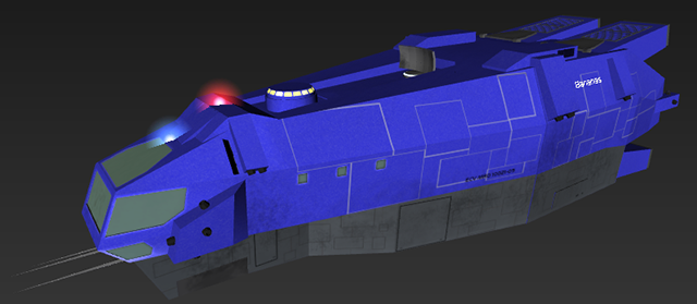
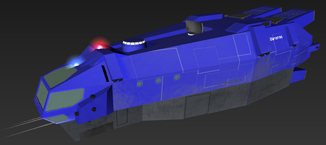
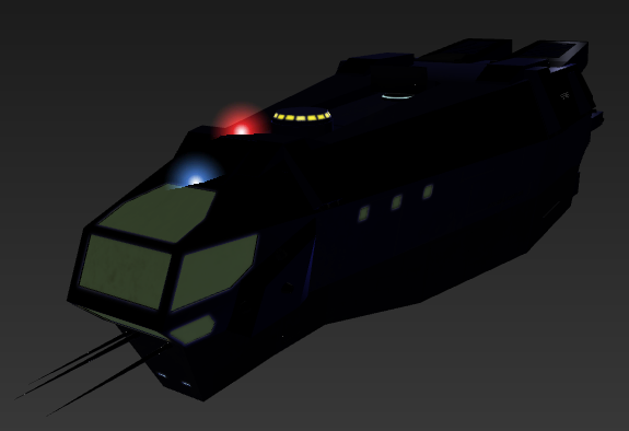
The glow map isn't so obvious in light, because your diffuse map has the windows so dark. Here's without the light. Because the diffuse texture has the windows as dark as it does, this is about as bright as the windows can shine, which actually isn't so unrealistic, but is different from most ships in the game which have very bright windows.
Anyway, you're free to use or modify the textures as you see fit -- http://www.keeper1st.com/pioneer/mro1000texes.zip
Perhaps the seams in the side panels could be less obviously gray, for example.
Naturally, you'll have to add
to the .model file in order to use them.
Nitpicks: The flaps that open to let out the landing gear need to be double-faced. When viewing through the model viewer at least, they are invisible from one side when open. Also, the flashing navigation lights are awkwardly placed. Traditionally, green lights are on the right side with red lights on the left. I'm pretty sure that's how all ships in the game are as well. I suppose you could break with tradition...
I've made a glow map and two pattern textures for random colour. The patterns are basically one speckled paint job where the grime appears darker than the paint, and one "clean" paint job but with the grime put into the alpha which makes the grime appear lighter than the paint. In both cases I didn't go full-bore on the colour, so they're often muted or pastel-like. For example, these pictures are with 0,0,255 -- as blue as can be.


The glow map isn't so obvious in light, because your diffuse map has the windows so dark. Here's without the light. Because the diffuse texture has the windows as dark as it does, this is about as bright as the windows can shine, which actually isn't so unrealistic, but is different from most ships in the game which have very bright windows.

Anyway, you're free to use or modify the textures as you see fit -- http://www.keeper1st.com/pioneer/mro1000texes.zip
Perhaps the seams in the side panels could be less obviously gray, for example.
Naturally, you'll have to add
Code: Select all
tex_glow mro1000glow.png
use_patternsRe: MRO ship for Haber Corporation Idea
Thanks. Oh cool. I'll check out the flaps today.
Keeper wrote: ↑Wed Jan 31, 2018 12:18 am Great looking ship.
Nitpicks: The flaps that open to let out the landing gear need to be double-faced. When viewing through the model viewer at least, they are invisible from one side when open. Also, the flashing navigation lights are awkwardly placed. Traditionally, green lights are on the right side with red lights on the left. I'm pretty sure that's how all ships in the game are as well. I suppose you could break with tradition...
I've made a glow map and two pattern textures for random colour. The patterns are basically one speckled paint job where the grime appears darker than the paint, and one "clean" paint job but with the grime put into the alpha which makes the grime appear lighter than the paint. In both cases I didn't go full-bore on the colour, so they're often muted or pastel-like. For example, these pictures are with 0,0,255 -- as blue as can be.
The glow map isn't so obvious in light, because your diffuse map has the windows so dark. Here's without the light. Because the diffuse texture has the windows as dark as it does, this is about as bright as the windows can shine, which actually isn't so unrealistic, but is different from most ships in the game which have very bright windows.
Anyway, you're free to use or modify the textures as you see fit -- http://www.keeper1st.com/pioneer/mro1000texes.zip
Perhaps the seams in the side panels could be less obviously gray, for example.
Naturally, you'll have to addto the .model file in order to use them.Code: Select all
tex_glow mro1000glow.png
use_patterns