Replacing the Big Crappy Station

Spacecrafts, buildings and other 3D asset creation
Post Reply
bszlrd
Posts: 1084
Joined: Mon Jul 01, 2013 3:25 pm
Location: Budapest HU

Replacing the Big Crappy Station

Post by bszlrd »

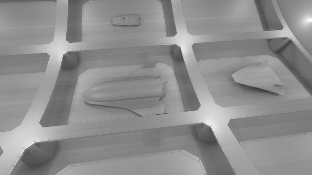
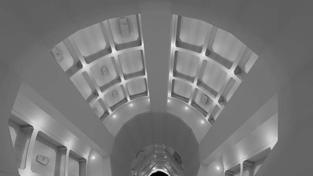
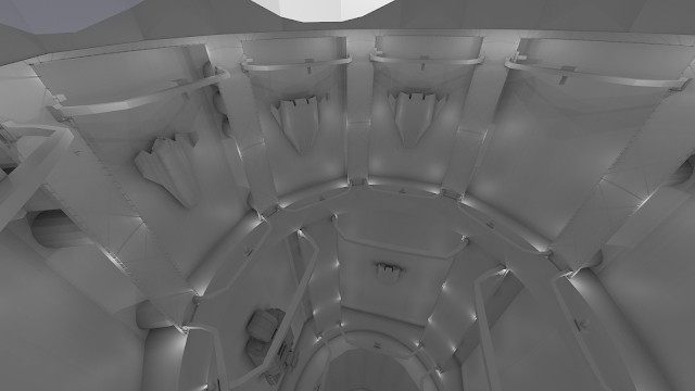
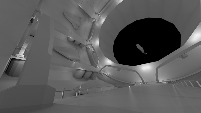
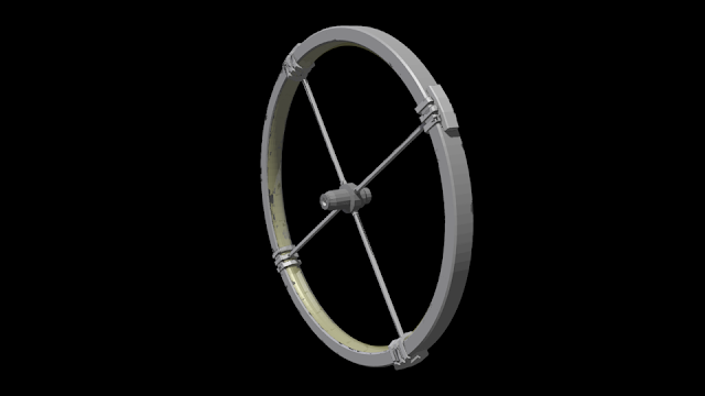
I've started some work on a replacement for the Big Crappy Station.
I'm enlarging the whole thing from about 2km to 6km diameter. The docking area is at around 250m diameter, which gives about Moon. Good for moving around stuff.
I'm putting in quite a few docks with cranes and whatnot, so it can be a busy transport hub. With some cleverly placed detail, like cargo containers, cranes, handrails and such, the scale of it will be quite visible. There will be 36 small, 8 medium and 4 large docks inside.
Here are some very heavily preliminary renders, mostly with wide lenses:
Image
Image
Image
Image
Image

Any early input?
Nyankosensei
Posts: 235
Joined: Wed Sep 11, 2013 8:03 pm

Re: Replacing the Big Crappy Station

Post by Nyankosensei »

Wow, probably i have to change computer for see this station ...
bszlrd
Posts: 1084
Joined: Mon Jul 01, 2013 3:25 pm
Location: Budapest HU

Re: Replacing the Big Crappy Station

Post by bszlrd »

If I manage to get it below 65k-100k tris, then it won't be a problem hopefully. The current ground station is about 63k.
Nyankosensei
Posts: 235
Joined: Wed Sep 11, 2013 8:03 pm

Re: Replacing the Big Crappy Station

Post by Nyankosensei »

And now how many poly is this one ?
bszlrd
Posts: 1084
Joined: Mon Jul 01, 2013 3:25 pm
Location: Budapest HU

Re: Replacing the Big Crappy Station

Post by bszlrd »

Right now it's 25k tri but will expand significantly.
jpab
Posts: 77
Joined: Thu Jul 18, 2013 12:30 pm
Location: UK

Re: Replacing the Big Crappy Station

Post by jpab »

It looks pretty good to me. There are some technical issues to think about, but I don't think there are any real show-stoppers. It might be necessary to accept some limitations initially so that the model will work in-game, and come back to it in the future as the code gains more features to support it.

Maybe the biggest problem we'll face in making it look good in-game is that we have only incredibly simple forms of in-game lighting at the moment. One of the reasons the current stations look bad on the inside is that the insides have no lighting at all; they're just completely flat. We don't have any shadow system at all, and I don't think we currently have any code to use real lights in models -- for ship navigation lights we just have the billboard light fixture, which is fine for that particular purpose but doesn't provide any illumination for nearby surfaces. Out in space that's poor but acceptable, but for stations to look good I think we need to start introducing something better.

To some extent you can get around this by baking lighting into textures. If I remember correctly you already do this for ambient occlusion, which is good. For the station you'll probably need to include any illumination you want from internal station lights in the texture. Eventually some of that lighting in the texture can be replaced with dynamic lighting so that ships are illuminated by station lights and the station can receive extra illumination from ship lights, but I don't know when someone will find the time to implement that. A proper dynamic lighting system would be really great, but I'm not sure I'd prioritise it above finishing the UI conversion and working on gameplay features.

We might hit performance problems if it's all one model, but I think we can find ways of coping with that. The most obvious is to split the model up into sections and allow different sections to be displayed at different levels of detail. Texture size might also be a problem, but again I think we deal with that when we reach that point instead of trying to predict exactly what will be necessary.

John B
robn
Posts: 302
Joined: Mon Jul 01, 2013 1:11 am
Location: Melbourne, Australia

Re: Replacing the Big Crappy Station

Post by robn »

Is the curve on the landing bays really that steep, or is it just because its so large and this is actually viewed from quite a long way away?
torham2234
Posts: 46
Joined: Sun Sep 22, 2013 1:56 pm

Re: Replacing the Big Crappy Station

Post by torham2234 »

I think that is just the fish eye effect of the wide lens.
Tichy
Posts: 132
Joined: Tue Jul 02, 2013 12:00 pm

Re: Replacing the Big Crappy Station

Post by Tichy »

Is it some kind of terrain that I'm seeing inside the torus in the first render, or it's a trick of light? :)
bszlrd
Posts: 1084
Joined: Mon Jul 01, 2013 3:25 pm
Location: Budapest HU

Re: Replacing the Big Crappy Station

Post by bszlrd »

@jpab: My intention from the begining is to bake in as much detail and lighting as possible.
There's a way to display different parts on a different lod level if they are in the same station/craft? That. Would help a lot.

@robn: It is the effect of wide angle lens (around 10-15mm) most likely, combined with the flat landing bay floors. Those are flat to allow easier landing and unloading.

@Tichy: those are render glitches due to distance, but there will be some terrain under the glass. Not much to show now.
Post Reply