New ship by BobtheTerrible
Re: New ship by BobtheTerrible
For people not logged into google drive or any other image service, there is only one image so far in this thread, and at least two that just says the words "image".
-
bobtheterrible
- Posts: 148
- Joined: Sat Jan 24, 2015 8:03 pm
Re: New ship by BobtheTerrible
Ok thanks for the comparison, Im a little less concerned now. Id be happy to post a link to the model file although Im noticing that the URLs for the images appear to be short lived :/
Its also my first real modelling attempt so it might make you eyes water a little - be warned /:)
https://drive.google.com/file/d/0B0_sTZ ... sp=sharing
Its also my first real modelling attempt so it might make you eyes water a little - be warned /:)
https://drive.google.com/file/d/0B0_sTZ ... sp=sharing
-
bobtheterrible
- Posts: 148
- Joined: Sat Jan 24, 2015 8:03 pm
Re: New ship by BobtheTerrible
Thanks impaktor Im looking into this now :-/impaktor wrote:For people not logged into google drive or any other image service, there is only one image so far in this thread, and at least two that just says the words "image".
Edit: I have run out of time to work out why my image urls keep going stale for this afternoon. Apologies. I will pick this up when Im back on line. If anyone has any suggestions I would appreciate the input. Regards, Bob
Re: New ship by BobtheTerrible
About the images: You could try using picasa, since you already have a google account. You can get thumbnail links from it for easy posting, and direct link too. I use it for this for a while, without much problem.
The image sharing is to the right when viewing the image:

You can copy the thumbnail link (set the Image only option) and use it with the [ img ] tag. The image height shouldn't be larger then 480p when embedding here. You can also use the for linking from the thumbnail. The direct link to the image opens it in the picasa site,which could not display for some people, but you can get the real direct url of the image by right clicking it there.
I'm not sure about the sharing settings. My Pioneer album is set to be visible to anyone who has the link, but it might not even needed.
The model is very nicely done. The front part is very good, with a nice flow of the shape, and the engine section is very good too. The way you blended the engine section with the main hull is very nice. Same goes for that intake-like structure with the gatling. But there are some areas that seem to be less confident.
I already like this ship. :)
I've annoted some areas that I think could be improved.
The image sharing is to the right when viewing the image:

You can copy the thumbnail link (set the Image only option) and use it with the [ img ] tag. The image height shouldn't be larger then 480p when embedding here. You can also use the
Code: Select all
[url=full scale image] [img]... [/img][/url]I'm not sure about the sharing settings. My Pioneer album is set to be visible to anyone who has the link, but it might not even needed.
The model is very nicely done. The front part is very good, with a nice flow of the shape, and the engine section is very good too. The way you blended the engine section with the main hull is very nice. Same goes for that intake-like structure with the gatling. But there are some areas that seem to be less confident.
I already like this ship. :)
I've annoted some areas that I think could be improved.
- The most important thing: the model scale should always be 1 an all three axes. Having non-uniform scaling will screw up a lot of things down the line, like when animating gear or UV-ing the model. I've set it to 1 on this file, but note that you need to unlink any clones to be able to apply the scale with ctrl+a, which works in object mode.
- The orientation of the ship is reversed, at least concerning Pioneer. Y+ is forward, X+ is right and Z+ is up. Also it's better to have the rotation at 0,0,0 so apply that too after you rotated the ship.
- The model is very tiny. Pioneer uses 1 blender unit = 1m convention. You can even set Blender up to display those in meters and centimeters (Scene settings, third icon). I've included a Mola Mola for comparison. It seems that it should be at least seven times larger.
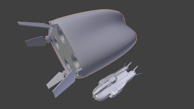
- It's easier to use the Mirror modifier for symmetry, than cloning (set it up for the fuselage). The beauty of it that it works together with other modifiers, such as subsurface smoothing.
- It's useful if you don't split sharp edges automatically, but set them up yourself. You can use the Edge split modifier for this, if you turn off angle based splitting. You can mark sharp edges in the ctrl+e menu.
- The top mid section seems to be unfinished. The idea is very nice, but right now it's too blocky compared to the rest of the ship.
I'd include a docking collar there, looking up. You can cut the nose one from the Malabar if you don't want to bother UV-ing it. - There are some adjacent triangles that seem to be unnecessary. I'd convert them to quads, because they are easier to work with.
- I'd ditch that gatling gun. It seems to be an overkill for a medium transport. It's quite huge anyway.
I'd put the retro thrusters there, or into a hole on the curved nose. - The area where you put that gatling gun feels too deep for me.
- The twin guns seems to be a bit overkill, but I'm not sure. Note that you can only put one to use in the game right now.
- Those conelike things next to the cockpit look a bit odd for me.
- I like the idea of that hex stuff. Sensors, right?
- There should be some heatsinks around the engines. It's only a visual nod to the nasty problem of heat management in space, but all ships should have them. (there are some which doesn't but we need to update those). If it's going to be a Kaluri ship, then you can use fins. You can import the Mola Ramsayi model for one that's already unwraped, and should be properly proportioned for it.
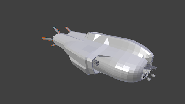
- Have you thought about RCS thrusters placement?
- Have you thought about landingn gear? Even if it's a no-atmo ship, it should have those for orbital station landing. Also there are a lot of atmoless worlds too, where it could land anyway.
- It's not clear if you want to blend the canopy ridges shape onto the main hull, or want it to be sharp. If you want it smooth, you will need some more edges there. Beveling it could be helpful (ctrl+b) I think it should be smooth.
- If you are considering this for Kaluri, then the cockpit should be less faceted and smoother.
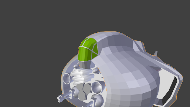
I've blended them a bit in the above image, and smoothed the cockpit.
This cockpit above feels like a one seater, but if you want a two or more seater, then the ship should be larger in my opinion:
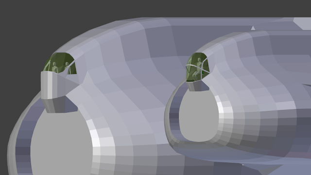
Scale comparison:
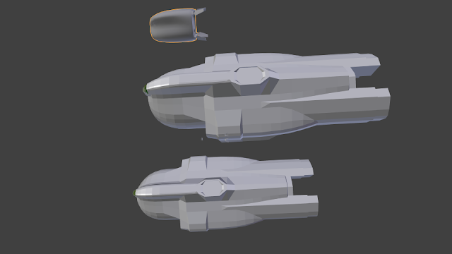
The bigger one is about 53m long the smaller is 33m, without the engines and front doodads.
-
bobtheterrible
- Posts: 148
- Joined: Sat Jan 24, 2015 8:03 pm
Re: New ship by BobtheTerrible
Holy <insert animal or deity of choice here>! How long have you had that model for?! Those cockpit modifications would have taken me a week to implement!
So first off many thanks for the comments and advice Im glad you are liking the model :)
Bob
So first off many thanks for the comments and advice Im glad you are liking the model :)
- Orientation and size: The scaling advice is very useful and the orientation I obviously got it back-to-front (it was originally pointing x+). I had a feeling the size would need some attention and was something I was intending to address after I had got the shape right but your explanation now makes that easier.
- Upper Air lock/Docking ring: I had intended this to remain a little "blocky" or slab sided but was finding it didnt gel well with the other smoothed surfaces - something to think about. I was planning to "draw" an air lock up there rather than model it :)
- Gatling Gun: It wasnt intended to be a gatling gun at all but some thingy-doodah for collecting hydrogen.. sort of. Basically you got where I was up to with the model and that included some fluff. It most likely wasnt going to make it to the end. Single gun placement point is also good to know.
- Hex sensors can stay; cones/missile pods can be reworked or dropped. An earlier suggestion of adding a docking collar here also seemed attractive but with one up top might seem excessive... I like the heat sinks although might shrink them fractionally.
- Edge marking: is something that I had read up on but not fully understood - I will have a play.
- Have I thought about RCS? Vaguely :) Is it best to model these or can I draw them in? I hadnt gotten around to adding any empties yet...
- Have I thought about landing gear? Not so much /:) This was complexity I was intending to punt down the field after getting the rest of the model in shape.
- Cockpit: I really like what you have done with the single seater. In my head I was imagining a two seater but in staggered-tandem format aka Air Wolf style (yes Im that old). I think that might put the size of the ship somewhere between the two in the last image. Basically I had gone with what was easiest which was extruding existing faces inwards slightly. If you dont mind I might keep the cockpit you have added :)
Bob
Re: New ship by BobtheTerrible
Heh, I'm modeling for a while now, maybe from the time of the Airwolf reruns around here :D
I didn't include those changes in the an-noted model, acutally, so here you go.
Regarding the upper airlock: I thing you are well within try budget to include a modeled one, like the ones on the Malabar for example. I think it would look better then a texture-only one.
You can model the RCS nozzles quite easily since they are just holes on the surface for Kaluri ships. I'll make a quick guide hopefully soon for that. (I was intending to do it anyway). Some ships have them only on their textures though, but I want to drill them in on those ships too.
And also you can reuse animated landing gear if you want, but that might need some finicking too.
Re: New ship by BobtheTerrible
TBH those "intakes" really bother me.
The ship also lacks the smooth lines characterizing Kaluri aesthetics - maybe make it somewhat more angular and make it into a Haber design?
The ship also lacks the smooth lines characterizing Kaluri aesthetics - maybe make it somewhat more angular and make it into a Haber design?
Re: New ship by BobtheTerrible
The "look" of the OKB Kaluri ships is currently only defined by two ships. I don't think that means that any new, third ship, should be restrained to being a mix of those two, and not add anything new to the "Kaluri" design. Or you could argue that it is an older/newer ship. Just look at how design of cars change over time, take SAAB for instance.
To make a music analogy, a band that releases three albums that all sound the same will have a very narrow definition of what their "sound" is, and if their fourth album sounds slightly different that will be taken as "wrong". There are bands with three very different sounding records and they can easily release a fourth album with yet another sound to it.
Also, I don't mind the intakes, everything doesn't have to be super rounded or smooth. The angles makes it look a bit old, heavy, and a bit rough (I'm thinking WW2), which I think is fine if that is what the ship designer is aming for.
Re: New ship by BobtheTerrible
Three, and no, any new ship shouldn't be a combination of those, but they still have established Kaluri stylistics to be "streamlined blobs with flat rear and radiator fins".impaktor wrote:The "look" of the OKB Kaluri ships is currently only defined by two ships. I don't think that means that any new, third ship, should be restrained to being a mix of those two, and not add anything new to the "Kaluri" design.
OTOH Haber look is only defined by one ship at this point and it's generally "ugly, but in a cool way" - make the front section (including cockpit) less rounded, rework the intakes into Haber-style retros and you have something more or less resembling a Haber ship.
Alternatively, making it look like Kaluri design would involve a lot of streamlining around the nose and entire mid-to-rear section (including dorsal docking port and hull behind it), covering up the nozzle sides and turning the intakes into streamlined hull extensions, possibly with retros embedded in them.
I don't care about smooth (hell, I really like OPLI ships which are ugly *and* boxy, but in a cool way), but I do hate stuff that doesn't make any sense, like air intakes in space.Also, I don't mind the intakes, everything doesn't have to be super rounded or smooth.
Scoops are optional equipment so I'd rather aim for having them mounted on the outside (and possibly retract/fold when not in use) than having gaping holes open in front of the ship for equipment that's possibly not even there.
That's why I'm saying it looks more like Haber ship. :PThe angles makes it look a bit old, heavy, and a bit rough (I'm thinking WW2), which I think is fine if that is what the ship designer is aming for.
Or make it a product of a new corp.
-
FluffyFreak
- Posts: 1353
- Joined: Tue Jul 02, 2013 1:49 pm
- Location: Beeston, Nottinghamshire, GB
- Contact:
Re: New ship by BobtheTerrible
What air intakes?
Aren't those where the retro engines go?
I am happy with the chosen manufacturer, and to see them get a bigger bulk ship.
Aren't those where the retro engines go?
I am happy with the chosen manufacturer, and to see them get a bigger bulk ship.