HuskySixDirty:
Sador is a fighter for sure. The combat one needs quite a bit of iteration to become anything usable. But I might experimtent a bit with a space tank idea there.
I didn't had any input on the engines of the Venturestar, I've just drawed that two ship retrospectively, to get a feel for the style of them. I don't really see too much problem it's external engines vs the Deneb's internal ones. I think it's plausible, since I interpret the Venturstar as a less elegant, more rugged ship relative to it. And engine style might depend on the role or quality of the ship too. Like the Pumpkinseed has very prominet bell nozzles, but the Mola's bells are recessed in the hull. And that SolFed? Fighter has a similar recessed but bell shaped engine setup, but it's intended as another shipyards ship, not really related to Kaluri.
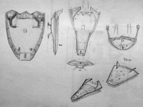
The main aim for these sketches now is to explore some styles, and a way to thread the yards together in a beliveable universe. Engine and cockpit style are basic points for a shipyard, but there should be other common things, like similar form types and layouts too, or typical details and such.
Curved, somewhat flowing shapes with occasional abrupt breaks, bell shaped nozzles, recessed cockpits and windows, wheeled landing gear and flapped heat-sinks for Kaluri for example. And also typically, engines placed on nacelles, retro engines are recessed most of the time, but not the main engines. Nacelles back side has that edge too, kind of like both ends on that SolFed one.Redundant, recessed maneuvering thrusters.
My aim is to find these kimd of common things for each shipyard.
And I certainly want more then 3 shipyards, as I imagine them as individual entites, who are related to a certain faction, but not owned by them. They would fullfil governmental orders though, like present day aircraft manufacturers. Except maybe for haber corp, if that's planned to be ingame. That would be an over- and micromanaged shipyard with ships along the line of the saying, camel is a horse planned by a comittee. And they would look ugly in a strange way. It will be hard to plan ugly but believable ships intentionally :D
More shipyards provide more contribution possibilities for the artists, and a general style guide could pave the way for more shipyards that are coherent with the general style in the future for those who don't want to model after somebody else's comcept art, but want to come up with own ideas.
Weathered texture adds to the believability of the ship for sure. It would be even better if it could be dynamic somehow, so if you buy a new ship, it's nice and shiny, but it gets weathered with use.
Tichy: a military that does it's job at the background, and you witness some of it's operations is the main idea. Like when you travel somewhere, and see some aircrafts flying by, or get a glimpse of a military base behind the concrete fence. But as I live in a landlocked country, I don't know how common are encounters with navy vessels in a civilian port for example, so I'm not sure, how common and elanorate military craft design should be. (Using the maritime analogue mainly due it's scale and more free movement)
As for sports, apart from obstacle courses, an orbital maneuvering race is what comes to my mind, a bit like in the way of a sailing race. You win by dexterity and intelligence, not by brute force. There was an intersting short story about a solar sailing race, I believe it was writen by Arthur C. Clarke, but I'm not sure.
I haven't reac Lila, but I'm interested for sure. The vast nature of the game could easily provide a setting for narratives like you read in the Zen... I was already thinking about making a comics in the Pioneer universe, but that has to wait for quite a while, after we nail down the art style. And come up with an interesting story first, so don't take it as a promise :).
Heh, another long post of mine, hope it's not boring :D
Ship sketches
Re: Ship sketches
The general back story behind the Venture star is that it is based on a military version (that I am still working on when I get 5 minutes of free time) that has hugely powerful engines designed to take it from the ground to low orbit as quick as possible. These engines produce a lot of heat and thus need the cooling fins.HuskySixDirty wrote: I also like the Deneb and Venturestar line. These ships look like brand new ones. Just one thought from me. I don't like the seperate engine designs. In fact I like the hidden Deneb engines more. It adds to the luxury and clean design and the whole ship design is very lean and functional.
The Venturestar is a civilian version that is made to look the same but with more conventional engines but the "look" has been left. Sort of the same idea as the Hummer vehicles, there are rugged military versions then they make ones for the general public that look similar but are in fact totally normal.
-
HuskySixDirty
- Posts: 2
- Joined: Thu Aug 08, 2013 4:37 pm
Re: Ship sketches
@ Zordey
Great explaination, thank you. The ships should really have the backstories in game as it was suggested a few days ago. Can't remember in which thead it was. Maybe I give it a try after I tried the smaller ones.
@ nozmajner
I tried a bit with Blender and Unity3d with C# and especially with the Blender part I'm not really good at it. I created one decent ship and a space station which looked more like a car wheel. Both without textures because at this point it got frustrating because I knew I had to do this again after changings to the model. Technically I managed to create a transparent 3d cockpit but it looked terrible. But maybe I can give you nethertheless tips regarding to create "ugly" space buckets intentionly which at least some players like to fly:
Oldtimer
In my garage I have two oldtimers. One was very good in regards of usability. My family used it for decades and there are many others in the market. The other one was really not much usable and was noisy and smelly. Its heavy one cylinder 2300 ccm 2-stroke motor takes almost one minute to start. The market did not want it and the company got bankrupt. There are very few now in the market and guess what oldtimer I love to drive now? The key to get a well loved oldtimer is first classic lines which are interessting to look at it even after decades and second exclusivity even if it is because of less usability.
Avantgarde
Some manufactures believe in their very advanced style. The customers however don't buy it because its to much away from the common style and has nothing classic in it. Take for example the back of Renault cars in 2005 I think. A second example is the Horten IX from 1945. The USA got this plane after WW2 which was 100 years ahead but the engineers did not show any interrest and it has rotten in a small hangar until begining of the 21 century.
Retro
Some people like the new Beatle or new Mini because they want to use a classic with new technology. Other people just think it makes no sense at all and you have to stick either with new design or just use the original oldtimers itself. A good examples for this style is also a naked bike.
Re: Ship sketches
I'm looking for a more functional way of looking ugly. Most of the examples you are mentioning are more like unconventional than straight up ugly. And you are mentioning Renault. The Citroën 2CV ugly duckling or the Trabant immediately came to my mind. Some consider it as very ugly cars, but they have character and appeal nevertheless. Due to nostalgic feelings for sure, but still they are living in a lot of people's memories. The Trabant was a quite disliked car too, and it's not a very good construction, but evokes a strong charm today.
The Haber Corp is a very antipathetic faction with a corporate rulership, so I imagine they don't care too much about pleasing it's inhabitants or anybody really.
I imagine it as the look of cheap household items or the very cheap Chinese merchandise for example. They fulfill their roles on a level for sure, but they lack the care of a good designer. They have decorations for the sake of decoration only. Their ergonomics are bad. The quality and choice of material is bad. There are burrs and sloppy weldings. But as a spaceship they need to have at least a level of quality to be spaceworthy.
And this kind of charmless ugliness is what I find challenging. They still have to fit in with the other crafts too, and should provide at least a bit of appeal of sypmhaty for the poor crew who needs to fly that hideous craft. And need to have the same mesh and texture quality and overall coherence too.
Oldtimers are other matter, since most likely there will be old and new types of craft on any timeframe, and they should look as if they are not produced and designed in the same year. That's another interesting design challenge.
Avantgarde usually means there are quite a lot of genuine thought and effort put into it, so they usually find their way to influence mainstream eventually. You already mentioned the Horten IX, but it's the same for the Impressionist movement (they were laughing stock for quite a while) or the a lot of things about experimental filming's way of doing film (like how about moving the camera? What the hell? Or editing the footage. Just to name some early examples).
Retro is even a harder question. Sometimes it's empty mannierism, sometimes, it's inspiration, sometimes it has to do something with functionality. One important question is that the copied or retro element the main appeal of the thing, or it's part of a considered design? Apple draws (or rips) quite an inspiration from the philosophy of Bauhaus, and those products don't feel out of place in the '21st century. Ikea draws from there too most of the time.
Hell yeah, pointless retro could be one way to that ugliness.
Actually I want to do some in-depth tutorials about crating modeling and texturing a ship. And not some how-to, but proper articles that address the why, not just the how. So I would appreciate any question you might have about ship creation/modelling/texturing. :)
Re: Ship sketches
I just thought... how about some ships with the Wave style, like you did for the Natrix? I always liked its line.
Re: Ship sketches
I was thinking about that today. I certainly want to do that. I think that manufacturer will specialize in atmosphere capable small ships mostly.
Re: Ship sketches
So here's some ideas for growing the Wave line. I think the manufacturer specializes in these kind of atmo/space hybrig fighters in the spirit of some kind of Harley Davidson. Like it was a warship manufacturer during the war, and to survive, it changed it's target group to vagabonds and such. These ships shouldn't have too much deltaV, but very good acceleration.
24: Wave's sister ships:

From left to right: A bit heavier and longer range one with three engines, a bit lighter one with one engine and an even lighter one with two engines.
The basic build is similar, and it's motorcylcle-like habitus too.
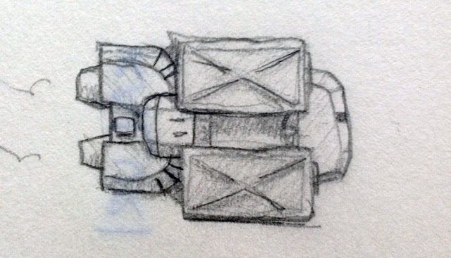
25 - And a freighter idea iteration, kind of like a previous one:

Maybre from OPLI Barnards Inc.
24: Wave's sister ships:

From left to right: A bit heavier and longer range one with three engines, a bit lighter one with one engine and an even lighter one with two engines.
The basic build is similar, and it's motorcylcle-like habitus too.
25 - And a freighter idea iteration, kind of like a previous one:

Maybre from OPLI Barnards Inc.
Re: Ship sketches
The single engine reminds me of the F19, that fake stealth plane (or the plane of an old game called Raid over Moscov). It has a slightly more complex shape that the other variants. More curves. I like it. It adds some variety without going too far from the original shape. :)
The lighter one with two engines is seen from the top or from 3/4 front? If it's from the top, I like that it is short. But I can't understand what the two flaps(?) looks like.
The lighter one with two engines is seen from the top or from 3/4 front? If it's from the top, I like that it is short. But I can't understand what the two flaps(?) looks like.
Re: Ship sketches
From the top. Those are maneuvering thrusters on a boom for better leverage.
Re: Ship sketches
Now I can see it. Nice idea! :)