You have a good point there. Where is the line between too simplified and streamlined? And at what point does streamlining start to eat away from the game instead of adding to it?impaktor wrote:So I think a game that automatically shows the missions that are in range, or in the same direction, and automatically figures out where to go, and which goods to buy for that destination, and which route in the star map to take etc. would just make the player into a zombie. Just click wherever the game tells you it's profitable to click, and the loop.
Part of the fun in the game is to plot a course, find a mission and be bold and see if you can make the deadline, etc.
I'd love to redo the whole interface, but I don't think anyone would be willing to start the thing from scratch. So I'm going to think about what we already have, and suggest improvements based on that. My biggest problem with the game is knowing what to buy and knowing where to sell it, and all the hassle to get it done.
The current process is this:
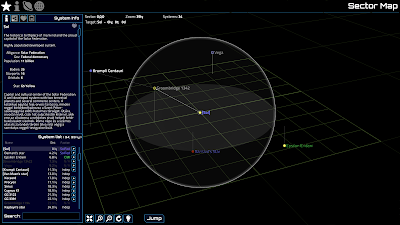
-> go to the Galaxy sector view
-> go to the system info
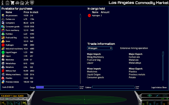
-> go to the economic info
-> try to memorize the exports
-> go to the Galaxy sector view
-> choose a planet at random
-> go to the system info
-> go to the economic info
-> try to remember what the exports were
-> go to comms
-> go to shop
-> buy stuff
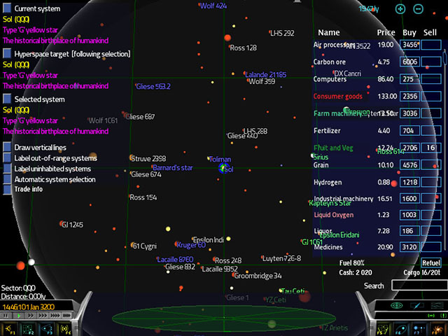
First of all, I think it makes no sense that I have to go to the system economic info screen to know the imports and exports. Same information could be given in the shop screen by coloring imports and exports with different color. Also, there is room in the right side of the sector view to show imports/exports. If there is room for that, adding a buying/selling buttons doesn't take that much more space... Could we do the whole mess in one screen? Time to start up Photoshop!
Edit: My image doesn't seem to work so here is a link: https://www.dropbox.com/s/05fczzqzhlpx5 ... ock-up.jpg
Looks pretty good for me! Now you have the stuff you can buy on the right, and see the price, in stock and in cargo hold information with one glance. You can buy and sell stuff by clicking the blue boxes. Different shades of green and red indicate imports and exports. When you click another system the price and stock info is hidden, leaving only colored item names. Refueling is also possible in this screen. You could add one more check box to arrange items by color. This mockup was made in 800x600 resolution, so it's kind of the worst case scenario. Wider screens would have more starmap visible.
This way the computer doesn't help you with searching for the next place to go or the most profitable trade route, you still have to do it by yourself. The only thing essentially different is that everything happens in the same screen, instead of seven. You could do the same thing with bulletin board. The other tabs at comms screen don't need the starmap, so those can be left as they are.
The process is simplified to
-> go to sector view
-> click trade info to see the exports
-> choose planet at random and see the imports (and if you have forgotten the exports you can find them quickly by clicking your system)
-> (click back to your location)
-> buy stuff
-> (click back to your destination)
You could simplify it even further by allowing the player to buy when viewing the other system, but it might be confusing to see the local prices and stock info while viewing other systems. Maybe it would help if they were visible but grayed out?
So what do you think? I'd love to have feedback and discussion about everything.
