HUD and UI ideas - mockups
Re: HUD and UI ideas - mockups
The news was more what I had in mind, but I really like the camera there. You know what, lets do both and get rid of that stupid and pointless face :)
Re: HUD and UI ideas - mockups
Here's one for the Equipment market.
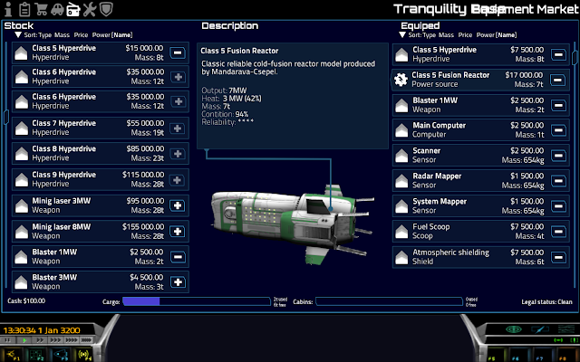
My idea with a ship spinner, and a line pointing where the equipment is on the ship (with the aid of additional tags).
I'm afraid it's not really 4:3 proof, and the layout is a bit cramped too. I'll check the version you mentioned too, Robn, with room for parts on an ortho ship, with drag and drop placement.
Re: HUD and UI ideas - mockups
No one more fitting that the author of the UI to add the necessary code. ping @robn :))
-
Hiro Pavonis
- Posts: 16
- Joined: Sun Dec 29, 2013 3:40 pm
Re: HUD and UI ideas - mockups
And 'possible to divide the list missions by type of mission?
This is because as a player, visually it is still difficult visual access to the list, which I would need a TAB spacing between title and description.
The player knows beforehand that such experience wants to do,
according to their own ship.
I would divide into 2 groups:
Commercial (passenger transportation, donations)
Military (Biographical small large peak, etc.).
would be nice to have an option large parcels
using the same "form" of passenger cabins.
or call cargo goods, and instead of passengers, goods details not present in the market.
it would be a little trickery to add a function to play more.
Re: HUD and UI ideas - mockups
@robn: Here are some muckup ideas about the sector map:
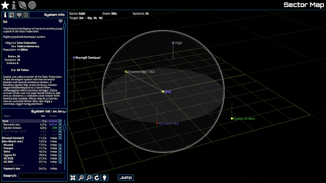
I put almost all info into the panel to the right. The upper portion has a bunch of tabs for different functions. This first one shows some general information about the selected system.
The lower portion is a System List that shows every system that's in view (depending on zoom and map position.) It's sorted by distance at default, but it can be shorted by name and faction too. The system the player is currently in would always be the first one on the list. Search moved here too (and coordinates could be searched too, like in the game). The little + buttons are shown next to systems that could be added to the route planner.
Uninhabited systems are gray, and systems already in the route planner are in [square brackets]. The selected system is highlighted too.
Double clicking a system would center it on the map.
The next tab on the upper part is the route planner:
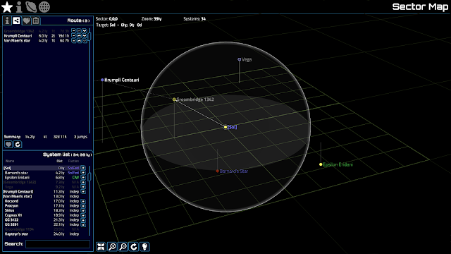
Which shows the list of systems in the route by the order of travel and could be reordered or removed. If the player doesn't want to plan route, then there's no need to do anything, If the route is empty, then the currently selected system will be there, without the need to add it, effectively setting it as the hyperspace target.
Systems could be only added to it, if they are within hyperspace range from the last system in the list. (based on hyperspace distance, assuming that the empty portion of the cargo hold will be filled with fuel. Also assumes refuel in each system). Or maybe systems could be added if they are in the furthest possible range the ship is capable of, and would be highlighted in red, if it's unreachable with current load and fuel amount. Or no limit in adding them, but they would be highlighted in red if they are unreachable. I'm not sure which one would work best.
A system could be added into the list several time, provided it doesn't come right after itself (for round trip planning for example). Or if it's next to itself, then it would be ignored.
Jumping to a system would remove that from the list, and set the next in the rout the hyperspace target, so no need to select it manually.
The map would also show the route with dashed arrows between systems.
Systems and routes could be saved as favorites for later use:
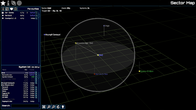
These might need some additional functionality, like renaming, load button, etc.
There's also a 4th tab, which is Filtering, so the player can filter out certain factions, star types, uninhabited systems, etc. These mockups might even show a bit of filtering, but I just didn't wanted to clutter up the image with a lot of stars.
Camera controls are at the bottom:
Also, there's a bit of color coding there, similar to the current Map, like the circles are colored by star type, and sys names by Faction. Also I made uninhabited systems a circle, instead of a solid spot.
And another thing I think would be useful, if the camera position controls would move it on the world's xyz coordinates, not in the view space.
This one is on a 16:9 screen, but it could in theory fit into 4:3, where the side panel would be about 1/3th of the view.
What do you think?

I put almost all info into the panel to the right. The upper portion has a bunch of tabs for different functions. This first one shows some general information about the selected system.
The lower portion is a System List that shows every system that's in view (depending on zoom and map position.) It's sorted by distance at default, but it can be shorted by name and faction too. The system the player is currently in would always be the first one on the list. Search moved here too (and coordinates could be searched too, like in the game). The little + buttons are shown next to systems that could be added to the route planner.
Uninhabited systems are gray, and systems already in the route planner are in [square brackets]. The selected system is highlighted too.
Double clicking a system would center it on the map.
The next tab on the upper part is the route planner:

Which shows the list of systems in the route by the order of travel and could be reordered or removed. If the player doesn't want to plan route, then there's no need to do anything, If the route is empty, then the currently selected system will be there, without the need to add it, effectively setting it as the hyperspace target.
Systems could be only added to it, if they are within hyperspace range from the last system in the list. (based on hyperspace distance, assuming that the empty portion of the cargo hold will be filled with fuel. Also assumes refuel in each system). Or maybe systems could be added if they are in the furthest possible range the ship is capable of, and would be highlighted in red, if it's unreachable with current load and fuel amount. Or no limit in adding them, but they would be highlighted in red if they are unreachable. I'm not sure which one would work best.
A system could be added into the list several time, provided it doesn't come right after itself (for round trip planning for example). Or if it's next to itself, then it would be ignored.
Jumping to a system would remove that from the list, and set the next in the rout the hyperspace target, so no need to select it manually.
The map would also show the route with dashed arrows between systems.
Systems and routes could be saved as favorites for later use:

These might need some additional functionality, like renaming, load button, etc.
There's also a 4th tab, which is Filtering, so the player can filter out certain factions, star types, uninhabited systems, etc. These mockups might even show a bit of filtering, but I just didn't wanted to clutter up the image with a lot of stars.
Camera controls are at the bottom:
- Center on current system.
- Zoom in and out
- Reset view rotation
- Highlight current system or route (dims everything else).
Also, there's a bit of color coding there, similar to the current Map, like the circles are colored by star type, and sys names by Faction. Also I made uninhabited systems a circle, instead of a solid spot.
And another thing I think would be useful, if the camera position controls would move it on the world's xyz coordinates, not in the view space.
This one is on a 16:9 screen, but it could in theory fit into 4:3, where the side panel would be about 1/3th of the view.
What do you think?
Re: HUD and UI ideas - mockups
Just for reference, here's a page from the Elite Manual, I hadn't noticed they've brought back the nav compass.

full size: http://s16.postimg.org/us1g1jqo5/2014_1 ... _scrot.png

full size: http://s16.postimg.org/us1g1jqo5/2014_1 ... _scrot.png
Re: HUD and UI ideas - mockups
Hi all, I just recently re-discovered Pioneer (have tried it a couple of years ago, did not like it back then, compared to Star Track Online and Battlestar Galactica online that I played in those days it looked a bit pale). I can see that over the time it has improved a lot. It is very nice to see a quite active community that is working on it.
However, I did not like like the style of icons on the control panel, so I set down this weekend and re-worked them to something I seemed to like, so I could enjoy the game a bit more while the developers continue working on hacking the code and re-organizing the GUI.


If anyone is interested please let me know I can upload my icons mod folder.
However, I did not like like the style of icons on the control panel, so I set down this weekend and re-worked them to something I seemed to like, so I could enjoy the game a bit more while the developers continue working on hacking the code and re-organizing the GUI.


If anyone is interested please let me know I can upload my icons mod folder.
-
FluffyFreak
- Posts: 1353
- Joined: Tue Jul 02, 2013 1:49 pm
- Location: Beeston, Nottinghamshire, GB
- Contact:
Re: HUD and UI ideas - mockups
That looks nice!
There's a Pioneer mods sub-forum over on SpaceSimCentral where users share their mods, I think that they have have some upload space.
There's a Pioneer mods sub-forum over on SpaceSimCentral where users share their mods, I think that they have have some upload space.
Re: HUD and UI ideas - mockups
Two thumbs up. Today's astronavigation is quite messed and this is a relief for my eyes.nozmajner wrote:@robn: Here are some muckup ideas about the sector map:
...
What do you think?
Re: HUD and UI ideas - mockups
I've uploaded my variation of the cpanel icons into my box drive if anyone wants to play with them, just drop the zip into your mod folder
https://app.box.com/s/jo96s3o04y0oschz1s7v
On a side note is there a way to make crosshairs pictures bigger, changing the size of the crosshairs icons did not help, it only worked for the for the mouse steering cursor?
https://app.box.com/s/jo96s3o04y0oschz1s7v
On a side note is there a way to make crosshairs pictures bigger, changing the size of the crosshairs icons did not help, it only worked for the for the mouse steering cursor?