Page 2 of 3
Re: Station graphical update
Posted: Sat Feb 03, 2018 10:42 pm
by Keeper
That's strange. Those two photos were jpegs instead of PNGs; I wondered if that might be the problem. I've no idea why your browser won't load images from my domain. Maybe it needs to be whitelisted or something...?
I had another idea for the ground station today, and added it to the zip file:
Re: Station graphical update
Posted: Sun Feb 04, 2018 10:06 pm
by Keeper
...and one more. I think seven patterns is enough! This one is rather like a big flower or something. Maybe a bit too much...? It certainly should be visible from far away!
I need to come up with more ideas for orbital station patterns. Different stripe designs. Any suggestions are welcome.
Re: Station graphical update
Posted: Mon Feb 05, 2018 10:35 am
by impaktor
Yeah, I think the last one is maybe a bit too much, the penultimate I like more, but that's just my personal taste.
Re: Station graphical update
Posted: Mon Feb 05, 2018 8:08 pm
by clausimu
I agree - the last pattern is a little too color-happy for me. But the one right before looks really nice.
Re: Station graphical update
Posted: Mon Feb 05, 2018 9:18 pm
by Keeper
I prefer that one too, to be honest. But maybe some planets or cities like a more flowery design.
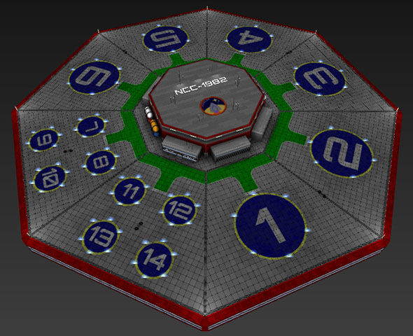
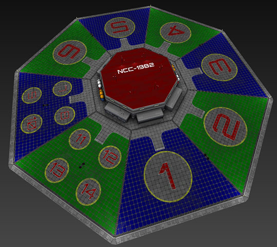
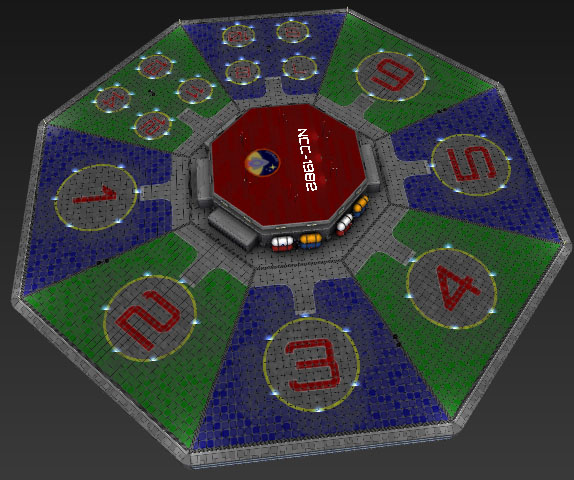
How about if I reduce the intensity of the colour on the pads, showing more burn-off distress?
Re: Station graphical update
Posted: Wed Feb 07, 2018 8:28 am
by Keeper
I have revisited the orbital station textures. Much cleaner now.
Also made DDS versions of the four patterns, reducing their size to 1024x1024 and ensuring no problems in the DDS conversion or scaling down.
ZIP file updated.
http://www.keeper1st.com/pioneer/station.zip
Now, how many pattern designs should the orbital stations have, and what ideas can you come up with?
Re: Station graphical update
Posted: Wed Feb 07, 2018 4:30 pm
by clausimu
Still, if I imagine a very colorful ground station between all gray buildings... I don't know... I think using color to highlight the actual landing pads and make the "walkway" more distinct was a great idea. Maybe you could use different colors or shades of colors there to distinguish stations?
Re: Station graphical update
Posted: Wed Feb 07, 2018 4:41 pm
by Keeper
Well, not all buildings in the cities are gray, you notice. Also, keep in mind that we're talking about random colors here. Those photos are showing the absolute boldest colors possible -- full red, full blue and full green. Very rarely does the game's random color generator manage to produce a super-deep color like that -- especially with the "weathered" version that I'm using currently (but which was not in the zip file until just now as I'm writing this). Also, that last design is only one of seven patterns, so you only have a 1-in-7 chance of seeing a ground station with colored platforms. So far in my travels I've yet to find one that looks particularly striking.
Re: Station graphical update
Posted: Wed Feb 07, 2018 4:55 pm
by nozmajner
Can't find the link to the PR or the thread, but if I remember correctly, there's an algorithm in there which tries to select nice color combinations, so it's not plain random.
Re: Station graphical update
Posted: Wed Feb 07, 2018 7:06 pm
by clausimu
I guess I'm showing my complete ignorance in texturing here. I was assuming that the colors you show are what is actually seen in the game. My bad... [hides in embarrassment]