Ha! I thought those intakes might cause issues :)
Ok in their defence the ship was very loosely based off an idea in my head and the intakes sort of "evolved" themselves into place as I was getting to grips with Blender. I tried justifying them with fixed scoops but basically everyone is right that scoops dont make sense in space! Im playing with putting retros in as FluffyFreak indicated, I think that will still work...
As for the overall design again I think I would be lying if I said that I was attempting to follow a specific design however it was intended to be a bit ugly. The intended style was a mix of rounded surfaces butting up to angular ones but primarily something indicating utility as opposed to aesthetic. I have been playing about with smoothing and split-edges and Im not totally convinced it looks... right... On the other hand the cockpit supplied by nozmajner is actually really nice and Im currently loathed to give it up (even if I was using this as a reason to learn something new)!
Im taking in peoples advice and opinions, its still a work in progress :)
New ship by BobtheTerrible
-
bobtheterrible
- Posts: 148
- Joined: Sat Jan 24, 2015 8:03 pm
Re: New ship by BobtheTerrible
HI All,
I have been meaning to post an update for a while but work and life keep getting in the way!
So. I have done my best to take on board the various comments and suggestions while at the same time tidying up some of the rougher areas.
[Blender file]
https://drive.google.com/file/d/0B0_sTZ ... sp=sharing
Comments and criticism welcome.
Bob :)
I have been meaning to post an update for a while but work and life keep getting in the way!
So. I have done my best to take on board the various comments and suggestions while at the same time tidying up some of the rougher areas.
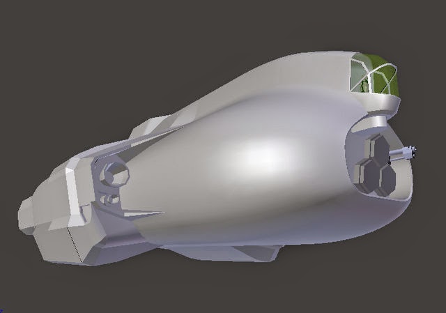
- tidied up the dorsal docking collar and added some detail.
- tidied up the rear ramp area and greebed some detail (not sure about that bit but gives an idea of intent).
- reworked the 'intakes' (to reduce the hate :) Im sort of OK with the way this turned out.... comments welcome.
- completely reworked the nose from the intakes forward as I found a couple of blemishes that I couldnt easily fix.
- reworked the joins between the engine and the main body (found a nice plugin that places vertices at face intersections).
- shrunk the engine housings and extended the nose. I think this balances the model out a bit better.
[Blender file]
https://drive.google.com/file/d/0B0_sTZ ... sp=sharing
Comments and criticism welcome.
Bob :)
Re: New ship by BobtheTerrible
Hi
Looks nice.
Here's a blend with some annotations.
I've put a Mola Mola next to it for scale comparison. (I didn't realized that there's already on in the file :D)
Some feedback:
Looks nice.
Here's a blend with some annotations.
I've put a Mola Mola next to it for scale comparison. (I didn't realized that there's already on in the file :D)
Some feedback:
- The docking collar is a bit too detailed, most of that could go onto the texture.
I'd also try a circular docking collar, since all other ships that have visible collars are having circular ones. In the sake of compatibility. (this will need some future revision anyway if external docking gets implemented, sizes are all around the place I suspect) - The proportions of it are nice. Feels like it does have mass.
- The greebling above the rear ramp feels forced. I think it would be better to ditch it. (I have a distaste for these kind of details. They are like filler words, not really needed, but a lot of people are afraid of silence, so they use them all the time. Horror vacui and everything. I always try to keep them at the minimum.) They don't really help establishing the scale anyway.
- The retro placement is nice, the small engine might be a bit redundant, but I think it looks good.
- I tweaked the blending between the engine pods and the main hull to be more flowing. Just an example, I think you can play with it for your liking.
- I've made some tweaks in the mid-front section too, mostly removed sharp edges which seemed unnecessary. (Circled the area)
- I'd increase the size of the heat-sink fins a bit, they feel tiny compared the rest of the ship. They are about the same size of the Mola's, but that ship is quite shorter, so it works better with it. Try increasing their length 1.5 times, that seems to fit it better.
Also, some of the heat-sinks have non-uniform scaling. You should fix that before they cause problems. - There were some flipped normals, mostly on the engines and the gun. You can recalculate them in edit mode using the [ctrl+n] shortcut.
- The engines doesn't need the face on their back, it won't be visible anyway. I tend to merge the engines onto the main hull in the end to reduce object count, and intersections. They can stay as floating geometry, you don't need to actually weld them to the hull, but they should be on the same mesh. I usually merge them after unwrapping them, so I don't need to that only once. (Provided they are clones of each other, so if you do something with one, the others change too, you can clone objects with [alt+D] in object mode.)
- There are some ngons you should triangulate/turn into quads, so they don't do anything unexpected upon UV-ing and export. I fixed some of them, but I didn't hunt for them, so there might be more.
- Don't forget to add landing gears.
- The cockpit feels a bit odd, because the eye level of the guy is right at the height of the frame. I draw a suggestion to fix that. Or you could just move the pilot up a bit, he won't be visible anyway.
- The sensor hexthingie is floating in front of the hull.
- I'd simplify the gun, or remove it altogether. It looks nice (albeit a bit like a bad-ass assault shotgun or something), but it draws too much attention onto itself and gives away the lack of actual visible weapons feature (which would change according to the gun type mounted). I'd use something similar then the Kanara or the Sinonatrix until we have multiple types of guns visually available.
- There could be some portholes behind the cockpit. They are good in showing the scale of the ship without cluttering it up. Although it might look odd if they are put there like in the side of the airplane, because the down direction is towards the main engines during acceleration. The Malabar takes this into account for example, and the windows are arranged in a way that it makes sense in a tail-sitter configuration. That's why they are that far from each other.
-
bobtheterrible
- Posts: 148
- Joined: Sat Jan 24, 2015 8:03 pm
Re: New ship by BobtheTerrible
Hi nozmajner,
Many thanks again for the input!
Bob
Many thanks again for the input!
- I had only just noticed that the docking collars were all round! I will have a play
- the greebing can go, I appreciated at the time that it didnt feel quite right... I find it difficult to remain silent in conversation...
- I like the engine pod blending but Im not sure about the bulkhead join - I liked the sharp edge step at that section as it also followed the line of the not-intakes. I will see what I can do.
- heat sinks were stolen goods from the Mola and were in the model for reference. Was it the length of the heat sinks or just the overall size that was problematic? Im tempted to make them wide rather than long as long elegant looking protrusions might look out of place on this brick
- I noticed the same about the cotpit (cockpit? Im spelling this wrong aren't I?) although modifying it without ruining the shape will test my blender abilities
- thanks for pointing out the normals on the engines I hadnt twigged the off colouring was normal related. Next to one of the retros you wrote "Pivot" Im not sure what that means?
- it is not so much that I have forgotten landing gear so much as Im actively not trying to think about it at all! I have no idea how Im going to implement landing gear - will they be fixed; will they need animating; how do I animate things; cant I just use aniti-gravity; that sort of thing :)
Bob
Re: New ship by BobtheTerrible
I was referring to the length of the heatsinks, but a wider one could also work. Only way to tell is to try and see.
I think it won't be that difficult to change the cockpit (yes, this is the correct spelling). You can just move and rotate them mostly. (I can do a modeling (let's say)"workshop" on irc, or some livestream app if you want, to show how I approach these things :) Would be a good opportunity to gather material for the ship creation tutorial I'm writing)
Inverted normals are one thing we should be on the lookout all the time. They are just odd coloring in blender if you have backface culling on, but they will show up as if the model was turned inside out in the game. Negative scale inverts them for example. Another error that creates funky normals is when you have an edge with more than two faces attached to it.
With the pivot for the retros, I was referring to the origin of the engine object, the baricenter of it. Usually it's better to have it somewhere where it's logical, like at the center of mass. Easier to work with it that way.
Don't sweat too much about the landing gear for now. Just build it as a crude static leg for now, and design it after you finished the other stuff. Scale only one hill at a time. If you are up to that "workshop" thingy, I can show you some ways to do landing gear too.
Also, there's no antigravity in Pioneer. :)
Re: New ship by BobtheTerrible
I have a question about cockpits. As I recall, it was deceided that they would not be allowed in the game's stock ships to keep the poly count low. Ships in the game now have a yellow area where the "glass" would be. In my opinion it detracts from the perceived realism of the model. Nozmajner has roughed out a nice cockpit for this model, but says the pilot won't be visible. Could we have some clarification on this?
Re: New ship by BobtheTerrible
The guy and the transparency is only to show the scale.
My comment on the placement of the guy was more like a general design question.
My comment on the placement of the guy was more like a general design question.
Or you could just move the pilot up a bit, he won't be visible anyway.
-
bobtheterrible
- Posts: 148
- Joined: Sat Jan 24, 2015 8:03 pm
Re: New ship by BobtheTerrible
Hi nozmajner
I would actually be up for a workshop. Having someone actually respond to specific questions and demonstrate how to do things properly would be immensely useful.
I dont know what time frames you were thinking of. Im guessing others might be interested in this so might be worth advertising on the forums and planing a little further down the line??
Bob
Re: New ship by BobtheTerrible
Thanks nozmajner. Is transparency forbidden? I have an idea for a very simple low-poly cockpit which would be covered with nearly opaque dark glass. It would give the impression that something is in there without straining the computer very much. With little glow map instrument lights it could look rather cool.
I won't be able to attend your workshop, but I'm looking forward to learning from your tutorial. I'm still at the beginning of the Blender learning curve. I've gotten as far as getting the bones in Gus the gingerbread man rigged.
BobtheTerrible, landing gear is a total mystery to me too. I'm thinking that getting that cookie to walk will give me a clue. I like your ship. It reminds me of a submarine somehow, especially from the top view. The radiator fins could give it a squid-like look. I like the green cockpit glass much better than that yellow color.
-
FluffyFreak
- Posts: 1343
- Joined: Tue Jul 02, 2013 1:49 pm
- Location: Beeston, Nottinghamshire, GB
- Contact:
Re: New ship by BobtheTerrible
Transparency not forbidden but complicated for cockpits because you can see through both sides simultaneously (when viewed from outside) and we don't depth sort transparent polygons... in short: it can look crap because of a rendering problem.