I was thinking about suggesting that too. Some kind of plating and visible structure would be nice. Doors, headlights, visible navlights and such.
For plating, you can draw some sketchy lines directly on the mesh, and then you can touch that up in gimp. This way Usually I do the lines of the plating in Inkscape, since it dynamically updates the imported images, so I can jump back and forth between it and Blender to check if they look good. This way you can easily adjust any alignment error along the seams. Then you can use those lines as a guide for the plating in Gimp.
If it helps, I can do an overpaint on a render or screenshot for you, but that has to wait a few days most likely.
Military Venturestar "Drop ship"
Re: Military Venturestar "Drop ship"
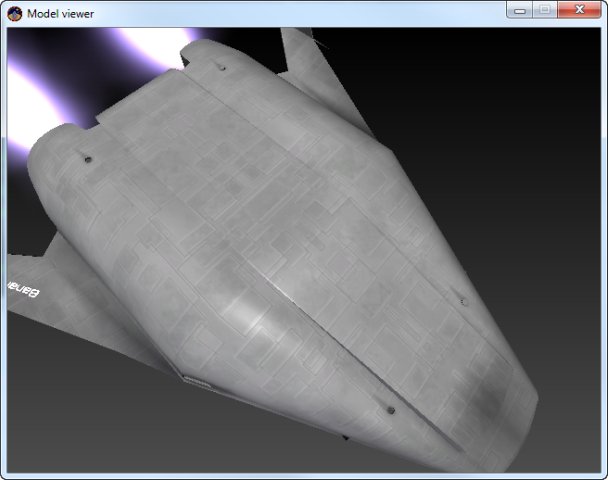
The idea of the Venture star was to have small tiles like the space shuttle so plates / seams would not generally be visible but for this military version i may change it to plates for a bit of variety and leave the original venture star looking cleaner with the small tiles...
-
NeuralKernel
- Posts: 36
- Joined: Tue Jul 02, 2013 1:42 am
Re: Military Venturestar "Drop ship"
Small units like that would make perfect sense for a 3D printed spacecraft... maybe literally an Open Source one in universe?
Re: Military Venturestar "Drop ship"
I kinda like those tiles they make a lot of sense, and add a feeling of material, but the problem with using only small tiles in my opinion that this way the ship seemingly lacks structure.
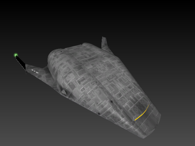
The two longitudal ridge would provide a nice place for a divider. The wings arent looking any separated from the hull, but the ship doesn't seem that unibody to mee. And a small area around the laterals provide another good opportunity for some detail too, like if it's a block that can be removed, not just a hole drilled in the hull. Maybe there could be an (spare) airlock somewhere at the front. And some hinting of the sensors.
And some kind if heat sink surface. Maybe on the wings or the arc of the hull. (That's a good oportunity for detail that not greebling)
Decals would be nice too, like indicators for the engines and laterals, airlocks. Maybe some colorable stripes somewhere, as some kind of platoon identifier. (The DC-3's of D-day had black and white stripes on their wings and fuselage for easy identification. The darker end of the control surfaces of the shuttle and the venturestar are quite nice in my opinion. You could follow along that thinking.
The main thing is that a good visual design has some kind of contrast. Not neceseraly light/dard. It could be bussy area versus less detailed area for example. The Space Shuttle or the inspiring Venturestar/X-33 are all very good examples of clusters of more bussier areas on the hull versus more clean ones. And you don't have to go overboard with detail. Just an amount of detail where it makes sense, and some large uniform hull panels for the rest.
The contrast is there on the mesh nicely though.
About adding wear. I don't think it would work if you do it in a noise style. There are some very distinct ways the ship could get weathered, and it's mostly related to the direction of flight. And the most taxing is reentry, where the nose and the belly looks forward most of the time, so they get the most punishment. So the ridgrs looking forward will be the most faded. Especially on the front of the craft. This effect might be there even in space during acceleration and deceleration, but on a very absolutelly less pronounced level as micrometeorites. But those could come from more directions then just front.
Doing that on the tiles by hand is very tiresome for sure, so you ight try tu automate that. You could copy the tiles of the hull to a new layer, bump up the contrast to almost black and white, and give a bit of noise to it so it's not uniform, and then add a small motion blur effect to it, like if wind blew trough the fromt of the ship. Now you can copy this layer to the tiles layer as a mask, and add a layer beneath it as the non-painted color of the tiles, that shows trough, where the paint chiped. Now you just haveto add a gradient to that mask, so it's more pronounced on the front of the craft then the back. Or instead of a gradient you could put a point light in front of your modell, shining in the direction of travel, turn off ambient occlusion and any other light source, and bake the shadow pass to a texture and youmhave a mask that shows how each part is at the reentry's mercy, and use it on the mask. But this is just an idea, I haven't tried the method yet, so you may have to do it diferently if it doesn't work properly this way.
The engine burn markings are a nice addition in my opinion. I like to add those, they add life to the texture.
Re: Military Venturestar "Drop ship"
I have been trying out some different ideas for hull plating, still not 100% happy but I think its getting there. Needs more fine detail I think.
Re: Military Venturestar "Drop ship"
Loking good.
I'd try adding some rythm to it with some areas of the older smaller pattern to give a place of rest to the eye. Maybe pronounce and differentitate some areas a bit more with more distinct plate lining. Like the engine and tank area from the cargo hold for example.
I'd try adding some military style decalslike we can see on modern aircrafts. Like a marking around thrusters and doors, or next to the fuel connector I've experimented with that on the pumpkinseed, but they are quite subtle.
-
NeuralKernel
- Posts: 36
- Joined: Tue Jul 02, 2013 1:42 am
Re: Military Venturestar "Drop ship"
That thing is coming along nicely! Now we just need a planet to invade ;)
Re: Military Venturestar "Drop ship"
I like the burned marks near the top nozzles. Nice touch!
Re: Military Venturestar "Drop ship"
Multiplying / Burning in the tile texture gives a nice "dirty" feel. I think ill change the wings to be a solid piece rather than tiled for some difference.
I have been experimenting with patterns and I seem to be getting an ugly multicolour edge around the pattern. Is this because I'm using black and white (should use black and grey for less contrast)?
I have been experimenting with patterns and I seem to be getting an ugly multicolour edge around the pattern. Is this because I'm using black and white (should use black and grey for less contrast)?
Re: Military Venturestar "Drop ship"
Isn't it a bit too much? The previous one looked better in my opinion. Making the wings more homogenous is a good idea.
The patter artefact might be caused by antialiasing I think, since that might generate small gradients around a hard edge. Does the colors change when you press r in the model viewer or when you change the colors manually?
The patter artefact might be caused by antialiasing I think, since that might generate small gradients around a hard edge. Does the colors change when you press r in the model viewer or when you change the colors manually?