Hey, nice one.
I think it could fit Haber, but it feels a bit too modern for them, and not charmingly ugly enough. Auronox of the Wave could be a better yard, since it specializes in revival of old military designs, kind of like Jeep or Harley Davidson. I think this ship could fit in that theme nicely. (Apart from Wave, there's a sketch for a ship named Tide, so I guess, some kind of similar naming would be appropriate. Something weather related, Mistral is on example that comes to my mind)
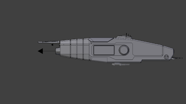
The overall shape and proportions are rather nice. And I like that the width of the fuselage stays the same almost all the way to the end of the ship. Feels utilitarian. (this is another argument against this being a Haber craft, I imagined that they try to be utilitarian, but they miss that somehow.)
It is nicely modeled, without any intersecting parts (apart from the landing gear), that's how I like it. :)
Do you have any more detailed brief, intention with it? Role, age, quality, backstory, such things.
I like the overall look of it, but since I'm a nasty nitpicker, here comes some feedback:) :
- The highest LOD feels to tri-heavy (27k) with those bevels. And it's not really needed in some places, like the base of the engines. I think most computers wouldn't have problem with it performance-wise. They can add a subtle feel of mass, but I think it isn't really necessary, since you won't be close enough to it to notice. And if you keep the LOD distance large enough, it can easily look glitchy, especially on low anti-aliasing levels. And you can hint it on the texture anyway.
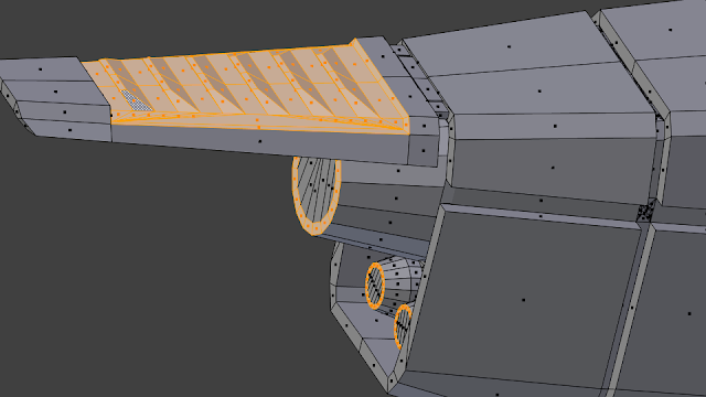
Also you can reduce the number of edges on the engines on lower LODs. And there are quite a few unneded faces on the lower lods, like:

Or the RCS thrusters. They aren't really needed on the lower LODs.
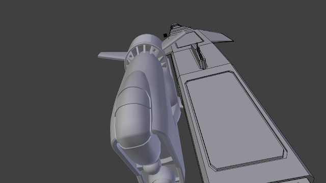
- I'd swap the large and small main engines, so the larger one is closer to the longitudinal axis of the ship.

- I'd do this part like this (my version is to the right). The wedge shaped one feels flimsy for me.

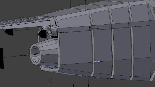
- The RCS thrusters feel small compared to the other ships. And for sideways movement/roll there's only one on the front and back, offsetted from the axis. This won't allow for lateral movement without roll for example. I think there should be a pair of them there:

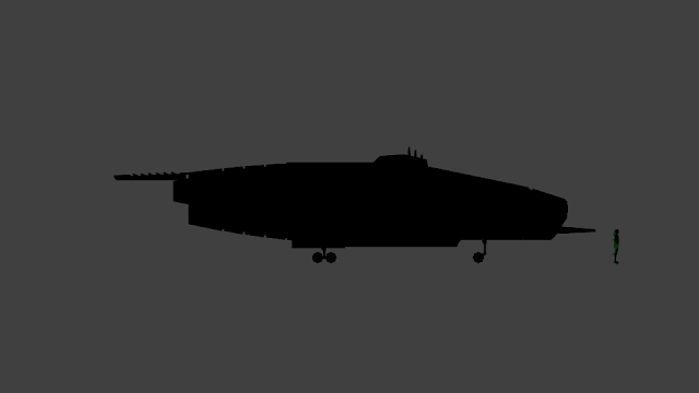
- The scale feels right for a scout ship in my opinion. It felt odd sitting on the medium bay of the orbital, but I put a human next to it, and I think it looks right, albeit cramped (you might want reconsider the scout role, if you mean extended deployments by that).

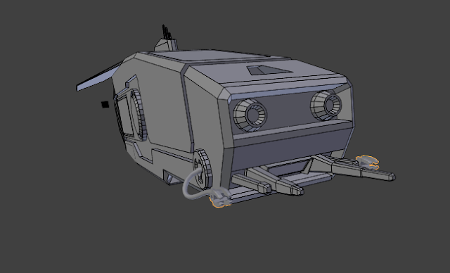
- Those manipulator arms look quite odd if you ask me. And it enhances the dumb face impression the retro thrusters create on the nose. I think they are not really necessary. Also they could implying functionality which is not in the game, but that's not a good argument, because there are other things implied but not present.

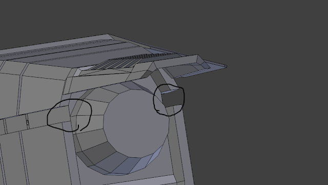
- Those winglets feel unnecessary too, and they are interfering with the docking collars on the side. It won't be trouble for two of these docking together, but I was unable to find a working orientation for the Kanara for example, and only barely for the Lunar shuttle. Mola and Pumpkinseed might work, but on a narrow margin.

- I like the asymmetry you created with the antennas and the heat-sink fin.
- I like the detailing of the heat sink too, I think I'll grab some ideas from there.
- The landing gear looks rather nice, but it's quite strange that they just stick out when they are lowered. It would look miles better with some kind of rotating and hydraulic mechanism. It's easy to set it up with a couple of damped track constraints and parenting, and then bake the movement to keyframes. The source for my ships should have them unbaked, in the asset git repo. (If you used blender anyway, but most modeling programs should have similar tools. I'm sure 3ds max and maya has it)
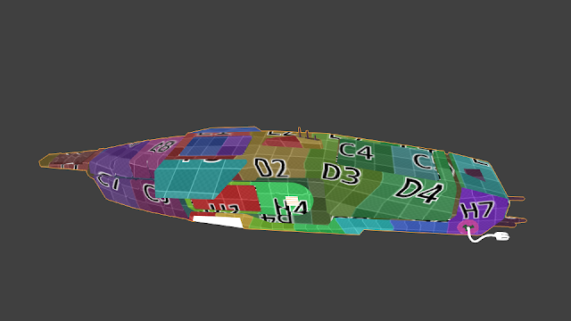
- The UV-s are quite distorted in some places.

They are nicely packed and arranged.
- Are those orange things on the front portholes or sensors? I'd say they shouldn't be potholes. At least I would not want to sit so close/between those retro thrusters if I could help it.
- The retracting gun feels a bit odd, but it's not that out of place.
These are what come to my mind checking out your model.


