Ship More Info Project

A quieter space for design discussion of long-term projects
Post Reply
TimothyHills
Posts: 10
Joined: Mon Oct 06, 2014 8:18 pm

Ship More Info Project

Post by TimothyHills »

Ship More Info Project

Introduction
This project is an expansion of the mod of the same name: http://spacesimcentral.com/ssc/topic/46 ... -info-mod/

With discussion I will edit this post to reflect the current aims and specifications of this project.


Ship Market Screen
To have in the Ship Market screen a More Info button to open the Ship Information screen, same as with the Crew Roster opening a crew members information screen. To leave the Ship Market screen as a summary of a ships specifications with a buy button.


Ship Information Screen
Have more detailed information of a ship.
Include the ship spinner.
Include silhouette graphic.
Include a Manufacturer field with logo.
Include prices and buy button.
Match the information with the wiki, for stock ships, using a template to ensure conformity.

Current headings used in the wiki for 17 ships:
Description (15)
Role (9)
Improvements and changes (7)
Other uses (6)
Notes (4)
Ship Name (1)
Known Issues (1)
History (1)

Proposal:
Use the fields of Description, Role, Improvments and changes, Other uses and/or Notes.

Use a market sales pitch, as in only the use of positive attributes, for the information. Any negative information to be provided by including a owner/pilot reviews section. Like you were buying the ship from Amazon.


Code Implementation
Make it mod friendly by making it so that to add a new ship one only needs to add the appropriate language file entries. To achieve this the ability to call a language entry with a variable is required, so as to remove the large 'if then else' function currently being employed. If this is already possible can somebody show me an example or else I will endeavor to write a language method in the source code.

The language file tokens generated by taking the ship name and replacing any spaces with underscores and suffixing with the field reference.

Code: Select all

AC33_DROPSTAR_DESCRIPTION
AC33_DROPSTAR_ROLE
AC33_DROPSTAR_REVIEW_1
AC33_DROPSTAR_REVIEW_2

In the language folder add a ships and manufacturers folder.


Future Project Spin Offs
A commodity information screen accessed by clicking the commodity in the Commodity Market. Description on one side and a slider control calibrated to available hold space/quantity in hold on the other to ease the buying/selling of multiple quantities.

An equipment information screen working in a similar fashion. Opens an avenue for 3D model enthusiasts to create equipment models for an equipment spinner.
impaktor
Posts: 992
Joined: Fri Dec 20, 2013 9:54 am
Location: Tellus
Contact:

Re: Ship More Info Project

Post by impaktor »

Awesome work.

I think it is especially well suited for the Ship Market screen. Once you bought the ship you don't really need the sales pitch, or read up on it. And if you do, you could always catch it in the Ship Market. Otherwise it feels like we're throwing this information at the player just "because we can".

I also prefer the "More info..." button approach, compared to the one shown in your last screen shot: http://timothyhills.me/pioneer_images/th_smi_ss_04.jpg but maybe I'm missing something?

Yeah, otherwise it's like we said on IRC, to work out the text on the wiki, follow a template, and the take it from there. Also, I suppose the text should be roughly the same length for all ships.
Like you were buying the ship from Amazon.
"This ship only has three wolves on it!"
TimothyHills
Posts: 10
Joined: Mon Oct 06, 2014 8:18 pm

Re: Ship More Info Project

Post by TimothyHills »

Interesting. I used the message box to get round clutter on a small screen resolution and prefer the last screen shot.

For me, the additional information contributes to painting the picture of a wider world rather than just having a flight simulator. To provide the means to create immersion by providing literary depth. Somewhere to be rather than just playing a game. If you get me drift.
impaktor
Posts: 992
Joined: Fri Dec 20, 2013 9:54 am
Location: Tellus
Contact:

Re: Ship More Info Project

Post by impaktor »

Yea, immersion is definitely what we're going for here, so I'm o the same page as you. The reason for my expressed opinion was that it makes the ship-spinner a lot smaller, and this is the main place to see the ship in, and also there is the eternal problem of fitting more information/text into a limited area, and getting it to look right on all screen resolutions.

Perhaps I'm changing opinion to the matter, in spite of these (potential) problems. I usually need some time to digest changes, so perhaps I spoke too soon.
nozmajner
Posts: 1079
Joined: Mon Jul 01, 2013 3:25 pm
Location: Budapest HU

Re: Ship More Info Project

Post by nozmajner »

Very nicely rounded up project.

The ship part of the wiki is a bit diverse, and sure could use some structuring. I could start some rewriting, nice project for my 80km commute. :)
I feel a bit strange about having a straight-on sales pitch next to the ship. Not sure why, but for some reason I think I'd prefer a bit more rounded description. Something like you would read in a craft review in a spaceship magazine. (even the wiki could be made into something like that). Maybe it's just because I'm not a big fan of boasting advertisements (as most of us for sure :) ). Especially for admittedly bad vehicles, like a Trabant, where the main selling point was that you can buy one, and you don't have to wait as much for it as for a Lada.
The sales pitch has it's appeal though, since it enriches the world a lot, but it sure needs that balance of user reviews you mentioned, in my opinion.

The text along the spinner feels more appealing to me, both visually and immersion-wise. The pop-up feels disconnected. But it's a nice fallback on smaller resolutions.
What character limit you suggest?

I were thinking about the ship market screen a while ago, even made some mockups (not insisting anything):
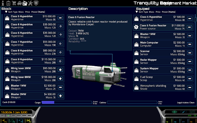
Image
One thing for me is that it feels strange that the ship list takes up half of the screen. The above mockup allows for a quite large spinner along the description text. It's on 1920*1080, and I only eyeballed the screenshot you made on lower res, but it might even work for that. It's 1/3 - 2/3 on the mockup, and an added nice thing about this ratio is that it tends to be pleasing to the eye.
Of course I don't know much about the UI engine, so I have no idea if that "small" change is how small actually. Not to mention the multi-line entries for the ships on the list, which could also buy some space.

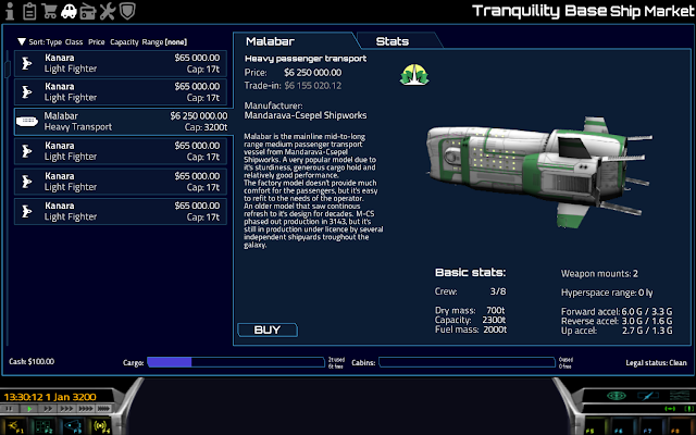
I also imagined that the right side could be tabbed. One tab for the general stuff and another one with more detailed data:
Image
This second page could be better home for the silhouettes maybe.
Also, about silhouettes: I have most of them in svg vector format (and it's simple to make any if needed), I can export them in any size, just tell me, how big they should be. These bring up a question of where to put them though. icons directory maybe?


I agree with impaktor, it feels strange to have the ship description visible on the ship info screen.
(Heh, just to play with the imagination, maybe there could be some kind of ship log with recorded data, like
  • "3rd March 3201 - Rough landing, scraped some of the protective coating, small repairs were needed."
  • "12th Jan 3202 Skirmish, several projectile impacts, extended repairs were needed."
  • "28th Aug 3202 - Hyperdrive breakdown due to poor maintenance."
  • "1st Sept 3202 - Hyperdrive class 2 installed."
Which could be generated for used ships too. )

An equipment information screen working in a similar fashion. Opens an avenue for 3D model enthusiasts to create equipment models for an equipment spinner.
Sadly there aren't a lot of 3D modelers around these days (Zordey and me actually, and I wasn't too productive in the past few month sadly), which might be a bottleneck. A very nice idea though.
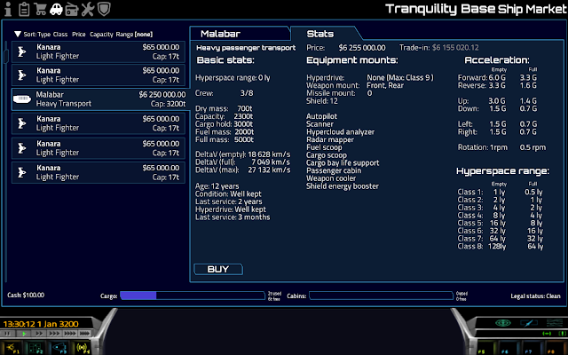
My stupid mockup hobby made me to do something about the equipment market too, even if it's purely in the realm of fantasy:
Image
Less modeling to do, and updating the current models with additional tags is not too much work.
TimothyHills
Posts: 10
Joined: Mon Oct 06, 2014 8:18 pm

Re: Ship More Info Project

Post by TimothyHills »

nozmajner I adore your tabbed mockups. Far nicer than what I was imagining.

I like the idea of a spaceship magazine review, would be more tasteful than a marketplace pitch and can still be balanced with positive and negative attributes.
What character limit you suggest?
When testing the description next to the spinner I found it was getting truncated as the multiline text box has no scroll bar. So at a screen width of 1600 a character limit of 750 ish worked. Of coarse if a scroll bar where fitted to the multiline text box then there wouldn't be this problem The table boxes have scroll bars in them already.
I agree with impaktor, it feels strange to have the ship description visible on the ship info screen.
By popular demand it looks like the ship description on the ship info screen is going to go.

Thanks for your feedback. Tabs, I like that.
FluffyFreak
Posts: 1342
Joined: Tue Jul 02, 2013 1:49 pm
Location: Beeston, Nottinghamshire, GB
Contact:

Re: Ship More Info Project

Post by FluffyFreak »

I just noticed the locator line on that last image. If you wanted us to do stuff like that it's quite easy, you'd need to add a named locator within the ship model, and we'll have to write some code to project the location on the 2D GUI and then dynamically draw the line too it. Not difficult though :)

As for the layout with Tabs etc, does anyone know what would be needed to do that?
Is it all Lua side stuff or do we need some C++ side code too?
impaktor
Posts: 992
Joined: Fri Dec 20, 2013 9:54 am
Location: Tellus
Contact:

Re: Ship More Info Project

Post by impaktor »

TH wrote:I found it was getting truncated as the multiline text box has no scroll bar.
I think a scroll bar will be needed, since even if it just fits in the English version, this might not be the case for translated text, say it is +/- 15% more/less text.
joonicks
Posts: 38
Joined: Thu Sep 17, 2015 7:23 am

Re: Ship More Info Project

Post by joonicks »

Hello! Your local friendly necromancer here to brighten your day.

Fluffy was asking whats needed to do the tabs. I think it could simply be simulated with buttons, but cut the bottom off the buttons. The Lua API would be the same as for normal buttons so that would simplify things.

I love the tab layout, hope to see it in game some day (soon?)
Post Reply