Some time ago I made a collection (mostly spacesim) HUDS, good for inspiration: http://headsupdisplays.tumblr.com/
Some further things I'd appreciate in our future hud:
1. On-demand visibility. Some things, like pressure readout or temperature gauge do not need to be visible all the time.
2. Modular design. By this I mean the ability to toggle, or even reposition components. It does not mean the HUD needs to be fully scriptable, just slightly configurable.
3. I'd prefer if the HUD does not scale with the resolution but stays at 1:1 pixel ratio. If I use a larger resolution, I want more visible area. Does not apply to all components, necessarily (targeting reticle).
HUD and UI ideas - mockups
Re: HUD and UI ideas - mockups
Grouping, collapsing and animations are all in the plan somewhere.FluffyFreak wrote:Is it fairly easy to move controls around? I'm thinking of things like, adding a bunch of controls or display widgets to a group and then animating them sliding on or off the screen?
Re: HUD and UI ideas - mockups
Agreed. Its made difficult right now because everything has fixed positioning. Fluid boxes and animations will help a lot here. And binds, maybe.Luomu wrote:1. On-demand visibility. Some things, like pressure readout or temperature gauge do not need to be visible all the time.
I think box reordering shouldn't be too hard. I'm already starting to think about how drag/drop might work, and I think its pretty simple.2. Modular design. By this I mean the ability to toggle, or even reposition components. It does not mean the HUD needs to be fully scriptable, just slightly configurable.
I've deliberately designed the UI so that there's generally no fixed-sized components. You often do want some scaling though, especially with text. Right now most automatic scaling is done against things like text line height, so proportions remain the same. I'm pretty sure we'll be able to make this work, but we won't know exactly what's right until we have a new flight UI (info screens are quite different).3. I'd prefer if the HUD does not scale with the resolution but stays at 1:1 pixel ratio. If I use a larger resolution, I want more visible area. Does not apply to all components, necessarily (targeting reticle).
In other words, I think the tech is on the right track. It had bloody better be considering how long I spent writing and rewriting and rewriting :P
Re: HUD and UI ideas - mockups
As far as my expierience with GUIs in games goes, it is usually more efficient to have a few different fontsizes instead of scaling the stuff. Text blitting is consuming enough as it is.You often do want some scaling though, especially with text.
Though, if you first build the entire element and then just scale the end result, it might not be that bad...
Re: HUD and UI ideas - mockups
We do have different sizes. We call them XSMALL, SMALL, NORMAL, LARGE and XLARGE. And our text rendering is pretty efficient these days - we spent a lot of time a few months back optimising the fast paths.TheBob wrote:As far as my expierience with GUIs in games goes, it is usually more efficient to have a few different fontsizes instead of scaling the stuff. Text blitting is consuming enough as it is.
But the point I was more making about scaling was more that the design of the UI system is that the user (ie programmer) shouldn't get too much control over positioning, and certainly not be allowed to specifiy pixel positions and sizes. Instead the idea is that you position elements relative to others (or to the screen itself) and the UI will try to make something that looks right based on the current display settings.
Not always, but it often is. Text will always be "unscaled" - if we need something bigger, then we ask the font engine for a larger size. Borders and shapes are textured, but are drawn as a 3x3 set of quads, with textures that can handle being scaled particular directions, so the UI can resize while still making them look good. The icons do get scaled, but not by much, and they're drawn to cope with a little bit of that. Other textures probably aren't going to scale well, but I'm really trying hard to make sure we don't need too many.Though, if you first build the entire element and then just scale the end result, it might not be that bad...
Re: HUD and UI ideas - mockups
@Luomu:
Is there a build available for your HUD experiments?
I kinda like that tumblr about huds. I was especially happy when I saw the G-Police one.
Also really like those motion trails and motion-direction feedback.
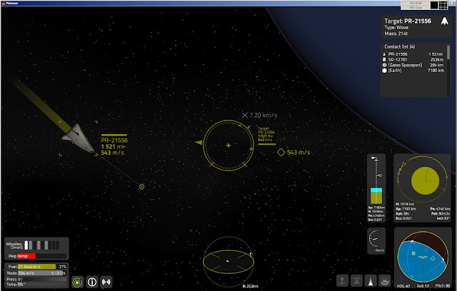
I've updated my mock-up a bit, with a target info display next to the reticule, a thinner dashed circle for indicating that the target is in the tracking cone (not really on the image), and a simplified orbit display (next to the more full-blown one, Apoapsis is always the top, Current height, Periapsis, atmosphere and surface indicators are always proportional to Apoapsis) and a climb rate indicator (not much relevance in orbit though). I think it would be useful if there would be a simplified version of every instrument where it's possible and makes sense, so the player can further customize the HUD.
I've also added a small scanner (displayed range is the farthest detected target, or could be set tu a set distance manually), like the one SolCommand made in his mock-ups, and also a target lead indicator. And a bit of update for the contact list, [bracketed] out of range contacts, detected by their nav transponder. And reduced the size of the bottom right displays.
Is there a build available for your HUD experiments?
I kinda like that tumblr about huds. I was especially happy when I saw the G-Police one.
Also really like those motion trails and motion-direction feedback.
I've updated my mock-up a bit, with a target info display next to the reticule, a thinner dashed circle for indicating that the target is in the tracking cone (not really on the image), and a simplified orbit display (next to the more full-blown one, Apoapsis is always the top, Current height, Periapsis, atmosphere and surface indicators are always proportional to Apoapsis) and a climb rate indicator (not much relevance in orbit though). I think it would be useful if there would be a simplified version of every instrument where it's possible and makes sense, so the player can further customize the HUD.
I've also added a small scanner (displayed range is the farthest detected target, or could be set tu a set distance manually), like the one SolCommand made in his mock-ups, and also a target lead indicator. And a bit of update for the contact list, [bracketed] out of range contacts, detected by their nav transponder. And reduced the size of the bottom right displays.
Re: HUD and UI ideas - mockups
...and THIS is the HUD I want on my ship :D
Where can I buy it? :)
Where can I buy it? :)
Last edited by Tichy on Tue Jul 23, 2013 12:29 pm, edited 1 time in total.
Re: HUD and UI ideas - mockups
Something worth thinking about are different HUD-modes. Especially if the HUD is completely customisable, it would make a lot of sense to provide a few different modes that can be configured separately, so the player can arrange different elements on each of them and switch between at the push of a button. I think that would take care of pretty much all concerns regarding HUD layouts.
Re: HUD and UI ideas - mockups
Good idea. Like a layout for in-system transfers, one when you are near a planet, another for combat. So you can focus on the vital informations, without being distracted by the others.
It could be completely customizable, while having come good default layouts.
It could be completely customizable, while having come good default layouts.
Re: HUD and UI ideas - mockups
These HUD mock-ups look really good! I'm really looking forward to having stuff like this in the game.
Having said that... I do have a suggestion or request:
This HUD feels very utilitarian to me. It doesn't feel like you're in a ship, it also doesn't feel like a helmet/eye-piece/retinal implant HUD. I do like clean and information rich UIs, which these are, but even so I think it would be good to incorporate some subtle cues to suggest that you're actually a pilot sitting in a physical ship out in space. Perhaps more generally it would be nice to have some decorative styling on these displays -- a lot of games go too far with non-functional decoration in the UI, but having none at all feels a bit spartan to me.
I'm sorry I don't have the artistic skills to make good, specific suggestions here. Luomu's HUD collection might be a good place to get inspiration. I think some quite common techniques are things like: Warping the display in the corners or making the whole UI curved to give an impression that it's being displayed on glasses/helmet/whatever instead of on a flat panel. Breaking the orthogonal everything-is-vertical-or-horizontal design -- things like gauges are often angled or curved. An idea that robn mentioned when I brought this up on IRC was including a little holographic projector in a corner or edge of the screen, which would give an explanation for how this display works, and also open the possibility for the display to glitch out when the ship suffers heavy damage (which is a little scenario that I've had in my head for a long time: you lose most of the UI and you're left with the harsh beauty of space; not something that would be effective if it happens often, but I think it could be quite powerful if it happens once)
Perhaps none of those ideas is suitable for us. I don't have a specific vision in my head of exactly what styling the UI should have... but I'm hoping that the more artistic members of the community can come up with something.