HUD and UI ideas - mockups

Post Reply
nozmajner
Posts: 1079
Joined: Mon Jul 01, 2013 3:25 pm
Location: Budapest HU

HUD and UI ideas - mockups

Post by nozmajner »

To start a conversation about HUD and UI
A while ago I've made some UI mock-ups. I was playing around with my ideas. And I was trying to find good usability solutions for things I think might be useful for a space simulator.

The most recent one ditches the bottom bar altogether. I haven't find a way I like to replace the radar plane yet. Contact list worked quite well in I-war 2 alongside with a small orb like radar, in my opinion, so maybe something like that.
Image
https://picasaweb.google.com/lh/photo/s ... directlink
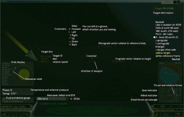
And a layer of explanation:
Image
https://picasaweb.google.com/lh/photo/X ... directlink

I think it would be useful if any of these UI elements could be minimized (displaying very basic data) and hidden entirely (only an icon for example), and there could be presets for different situations, the player could cycle trough.
The Navball (or artificial horizon)idea is from Kerbal Space Program really. I think it's a quite valuable tool, even if it needs a bit of time to get used to.
It's basically a sphere, half of it brown, half of it blue. The brown side indicates the surface, the blue is the sky. Center of each hemisphere is the Zenith and Nadir respectively, and on the equator of it there are the basic compass directions of North (0°), South (180°), East (90°), West(270°). It represents the orientation of the planet under the spaceship. If the boundary between the two hemispheres are a straight level line, then you are perpendicular to the ground for example, but if you only see a brown circle, then you are gonna crash to the ground. The markers on it are similar in nature to the prograde markers and target markers of the main view.

An older version with the bottom bar:
Image
https://picasaweb.google.com/lh/photo/Z ... directlink
Image
https://picasaweb.google.com/lh/photo/k ... directlink

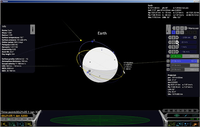
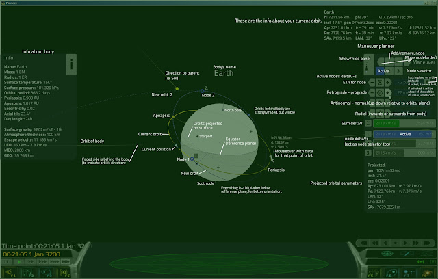
And some ideas for a more in-depth in-system navigation screen:
Image
https://picasaweb.google.com/lh/photo/w ... directlink
Image
https://picasaweb.google.com/lh/photo/l ... directlink

Fluffyfreak said thet there were discussion about these things, but I was unable to find the threads.
What's your opinion about these?
Tichy
Posts: 132
Joined: Tue Jul 02, 2013 12:00 pm

Re: HUD and UI ideas - mockups

Post by Tichy »

I find your new hud absolutely briliant. It also looks easy to understand. About the radar, I find the usual scanner very clear, but I can't think a position to place it, beside bottom-center.

System orbit view. While it looks a bit cluttered, I'm very tempted by your maneuver planner and I have to admit that it shows many informations that I searched when I was playing with the orbits. One thing that I'd like to see is where are the nearest suns (or which sides of the planet are illuminated and which are shadowed), because I prefer to land on the day side of the planet.
nozmajner
Posts: 1079
Joined: Mon Jul 01, 2013 3:25 pm
Location: Budapest HU

Re: HUD and UI ideas - mockups

Post by nozmajner »

Thank you :)
I'm not really a fan of that ellipse scanner, to be honest.

Orbit view layout needs a lot of cleanup and a better visual organization of data for sure. I really hoping that the orbit display will become more readable when the user can rotate around the view. (I'm thinking about making a simple interactive mock-up in blender for it if time allows, to verify that).
That dot and fading line and the body's orbit itself indicates the illumination of it a bit. I'm using a faded, darkened display here to give a visual clue about the equatorial plane of the body, and the position of the orbits relative to it, and I think another level of darkening might clutter it up even further. I also aim for day side landing if I have the option.
TheBob
Posts: 76
Joined: Sat Jul 06, 2013 6:04 pm

Re: HUD and UI ideas - mockups

Post by TheBob »

Love everything about it, except maybe for the grey background of the displays. Other than that, brillian, brilliant, brilliant I say! (I'd hit it... With a HAMMA!)

Especially love the DV calculator in the system view. Now, if we'd get something like that, that would be really cool. Might even open the possibility to tone the engines down to more reasonable levels. Nah, then we'd need burntime integration and stuff like that, and the game would probably become too hardcore...

btw, Normal and Antinormal is often called "planechange velocity" to make it a bit simpler.
nozmajner
Posts: 1079
Joined: Mon Jul 01, 2013 3:25 pm
Location: Budapest HU

Re: HUD and UI ideas - mockups

Post by nozmajner »

Thank you.
I choose gray because of it's neutrality, so it won't overshout the color clues of the orbital displays.
Aren't the radials are the plane change (inclination change ones). Normal and antinormal are more like for rotating around the apsises. At least if you consider normal as outward from the center of the orbited body and radials as perpendicular to prograde. But I might confused these a bit. Yes, I've just confirmed it, and yes, I've mixed up those. Normal of the plane of the orbit and radially out or inward from the focus of the orbit. My bad.
NeuralKernel
Posts: 36
Joined: Tue Jul 02, 2013 1:42 am

Re: HUD and UI ideas - mockups

Post by NeuralKernel »

Any way to get a floating reticule like modern fighter aircraft use? Aeron did it quite nicely.
http://aeron.sourceforge.net/
Luomu
Posts: 58
Joined: Mon Jul 01, 2013 1:30 am

Re: HUD and UI ideas - mockups

Post by Luomu »

Here are some of my hud experiments so far.

Image

- traditional message list instead of one that hides the scanner (the only good place to put it was above the cpanel - I can't take the cpanel apart yet)
- radar contacts have trails drawn after them (IFF colored)
- the center reticle is now a circle, somewhat represeting an area where your guns can track a target. When a target is within firing cone, the inner circle appears (as in the screenshot)
- quick target info next to the reticle, instead of showing it next to the target, so it never moves around or disappears
- target info consists of: target integrity, name, distance and velocity
- the target info flashes when you score a hit, so there's no doubt if you are hitting or missing
- the locked on target does not have a label drawn on top of it to reduce clutter, since it's in the quick target info
- AR speed lines/"space dust" type effect to give a sense of motion & direction (not well visible in a static screenshot)
- the crosshair is a remnant of the old hud, it's not really necessary

There's a bunch of other things too. It's all playable if you want to try: http://github.com/Luomu/ssp

Some things I would want:
- a contact list
- secondary target info (ship silhouette, cargo analysis) in a corner when you have an analyzer installed
- smaller scanner, the current one is so wide (mostly get rid of cpanel in favor of more modular design)
- any components like player's hull integrity or weapon temperature should fade out when not needed, aiming for a decluttered view
Tichy
Posts: 132
Joined: Tue Jul 02, 2013 12:00 pm

Re: HUD and UI ideas - mockups

Post by Tichy »

I like to have the informations about my selected target (the ones useful in combat) in a fixed centered position near your crosshair (or the instrument thai indicated where I'm aiming), so I don't have to serch them with my eyes. More detailed informartions could be displayed in a screen corner.

About Nav and compasses, you should also take a look at this: http://pioneerspacesim.net/forum/viewto ... rt=10#p171
Personally, I prefer the navball concept. I find it less cluttering and intuitive enough, but the compasses could be more easy to use when you are near the ground.

I think that my previous thread ( http://pioneerspacesim.net/forum/viewtopic.php?f=3&t=23 ), could be merged here.
One information that I really love to have, is the distance needed to arrive to a complete stop relative to my target, or a graphical clue that helps me to find when I should start breaking. This must be related to my relative speed and the power of the thrusters facing the direction in which I'm flying. Whith something like this, in-system transfers would be much easier. At the moment, if I want to move from one point to another, I must guess or calculate this information, or use the targeting tunnes... but I find them too cluttered and prone to misinterpretations.
TheBob
Posts: 76
Joined: Sat Jul 06, 2013 6:04 pm

Re: HUD and UI ideas - mockups

Post by TheBob »

Aren't the radials are the plane change (inclination change ones).
Nope. Normal and Anti-normal are perpendicular to the orbital plane. I.e. if you thrust in those directions, you're changing the inclination of the plane, hence planechange velocity.

Radial velocity (usually called "outwards"-velocity, often even if it goes inwards, similiar to retrograde being called prograde negative) is perpendicular to the prograde vector, but parallel to the orbital plane.
FluffyFreak
Posts: 1342
Joined: Tue Jul 02, 2013 1:49 pm
Location: Beeston, Nottinghamshire, GB
Contact:

Re: HUD and UI ideas - mockups

Post by FluffyFreak »

You might also want to look at the stuff that LionHeart is doing here http://spacesimcentral.com/ssc/topic/3474-ui-concepts/ which are pretty cool.

I think it's near universally agreed that the control panel (thing along the bottom with scanner) has to DIE DIE DIE asap and move the elements into things which are located around the screen.

@robn,
Is it fairly easy to move controls around? I'm thinking of things like, adding a bunch of controls or display widgets to a group and then animating them sliding on or off the screen?
Post Reply