I intended it to be quite utilitarian. At least the first iteration, so I can explore some functionality, and the aesthetics that they bring.
It sure needs some of what you are mentioning, but additional decoration will have to wait. I'm not even sure about the look of quite a few things. Like the icons, or the dark grey boxes with rounded corners for example. Anyway, I want to keep it mosty functional. I like those things you said about hinting how it works, like holographic projection and such.
But this whole thing is just a mockup without any implication to be ever ingame in any form, it's just my collection of my ideas.
HUD and UI ideas - mockups
Re: HUD and UI ideas - mockups
Yep, that's perfectly understandable. Plenty of time to play with different styles and decoration later!nozmajner wrote:I intended it to be quite utilitarian. At least the first iteration, so I can explore some functionality, and the aesthetics that they bring.
John B
Re: HUD and UI ideas - mockups
Nozmajner, I really like your hud concepts, they are really brilliant and add I cannot wait so see them implemented.
-
Nyankosensei
- Posts: 235
- Joined: Wed Sep 11, 2013 8:03 pm
Re: HUD and UI ideas - mockups
is possible add a widget that shows the distance to the full stop?
i have made 1 idea for a hud, i like more rounded widget but for now i think is not too hard make a HUD like this

but a good hand of an artist is definitely better
i have made 1 idea for a hud, i like more rounded widget but for now i think is not too hard make a HUD like this
but a good hand of an artist is definitely better
Re: HUD and UI ideas - mockups
Just to wake up this thread a bit. :)
I was playing around with my mockup:
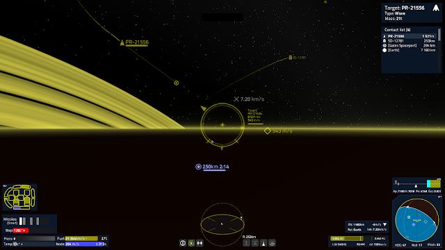
I'v added an idea for a Brachistochrone helper that measures acceleration time and deltaV towards the target (bottom right next to the navball), added a simplified orbit display (above the navball), and reworked the thrust indicator (bottom left above wep).
I was playing around with my mockup:
I'v added an idea for a Brachistochrone helper that measures acceleration time and deltaV towards the target (bottom right next to the navball), added a simplified orbit display (above the navball), and reworked the thrust indicator (bottom left above wep).
Re: HUD and UI ideas - mockups
Cool!!! :D
Do you think that it will scale or rearrange at different screen sizes? Since there are many little labels and objects, I think it would be better to rearrange than scale down.
The scanner could be made to change shape/position/size when, for example, you are under attack or when there are more than one object near your ship?
Re: HUD and UI ideas - mockups
I can't tell you much about that, since it's just a mockup. It should'n be any smaller then this, and it fits in a 4:3 aspect ratio with less space in the middle. The widget sizes shouldn't be too dependent on resolution anyway in my opinion.
-
FluffyFreak
- Posts: 1343
- Joined: Tue Jul 02, 2013 1:49 pm
- Location: Beeston, Nottinghamshire, GB
- Contact:
Re: HUD and UI ideas - mockups
I like, is pretty
Re: HUD and UI ideas - mockups
I forgot to put this here, so: some Trade UI mockup I made after robn showed what he's working on.
Re: HUD and UI ideas - mockups
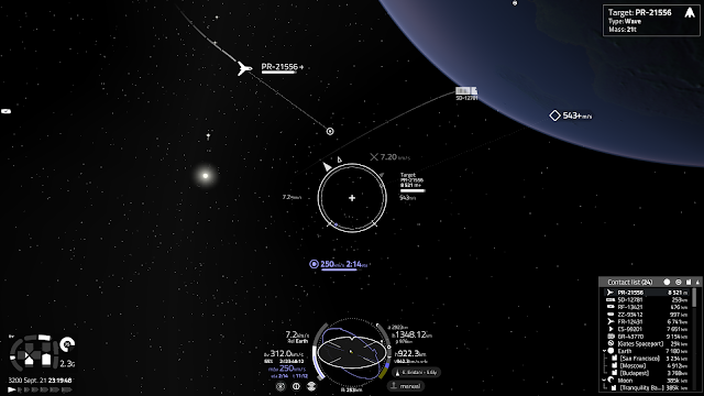
A bit of play with my mockup during the holidays. :)
Switched to a white overal color out of curiosity and payed around with some of the instruments. It's a bit clearer now, and properly fits to 4:3 too. It needs some dark transparent background for stuff to stay readable while facing towards something bright. (Like the Prograde marker over Earth)
I've put a simplified navbal onto the scanner, and moved the speed and deltaV readouts to the left of it (gauge shows max capacity(gray), current propellant level (white), maneuver deltaV(blue) and current speed (smaller gray)).
Distance and orbit info to the right.
Thrust indicator to the left side of the screen, contact list to the right. Orbit gauge shops apsees and current height to body center, and there's a surface altitude and vertical velocity readout bellow them.
A comms panel could go to the right also, and a ship and wep status to the left, above the thrust readouts.
Hyperspace button shows the target and it's distance.