TabGroup container and comms panel
Posted: Sun Feb 16, 2014 4:06 am
Just wanted to show off what I've been working on:


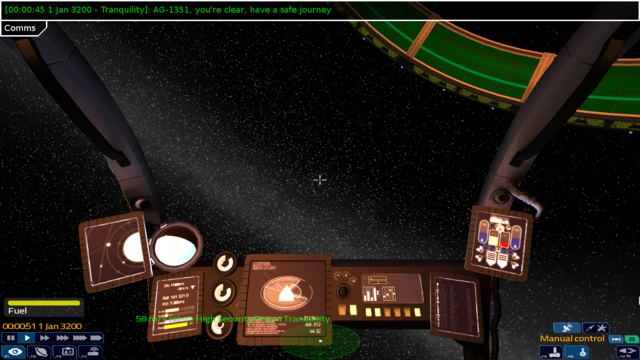
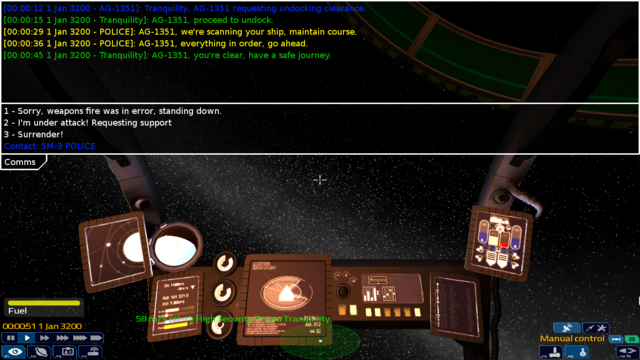
Ignore the actual comms text; what's there so far is really just a placeholder. Its the border and headers that are the interesting bits.
It can take multiple tabs, with an arbitrary widget in the header (these samples only show Label headers). It has transparent and opaque modes.


Clicking on the header for the currently open tab will collapse it, which is what you see up the top with the comms.
I've been using nozmajner's mockups as a guide. I want this to be usable to implement some of his ideas.
Since we have the TabGroup Lua widget as well that drives info/station/settings views, I might have to rename one of them. No big deal.
Still work to do, most significantly allowing widgets to be placed in the area to the right of the tab headers, and possibly even showing a collapsed version of the current header. There's also some spacing and other bits to adjust. Its coming along nicely though.
As for the comms panel, my intention is to have the priority shown with an icon on the left. Important messages will automatically expand a collapsed comms panel, and be more brightly coloured to draw attention to them. If the message has a sender, it will be colourised and clickable to set target (ship or station). And of course since its got the entire UI engine behind it, it can theoretically do anything else we might want.


Ignore the actual comms text; what's there so far is really just a placeholder. Its the border and headers that are the interesting bits.
It can take multiple tabs, with an arbitrary widget in the header (these samples only show Label headers). It has transparent and opaque modes.


Clicking on the header for the currently open tab will collapse it, which is what you see up the top with the comms.
I've been using nozmajner's mockups as a guide. I want this to be usable to implement some of his ideas.
Since we have the TabGroup Lua widget as well that drives info/station/settings views, I might have to rename one of them. No big deal.
Still work to do, most significantly allowing widgets to be placed in the area to the right of the tab headers, and possibly even showing a collapsed version of the current header. There's also some spacing and other bits to adjust. Its coming along nicely though.
As for the comms panel, my intention is to have the priority shown with an icon on the left. Important messages will automatically expand a collapsed comms panel, and be more brightly coloured to draw attention to them. If the message has a sender, it will be colourised and clickable to set target (ship or station). And of course since its got the entire UI engine behind it, it can theoretically do anything else we might want.


